During the FSCPE (Federal State Cooperative on Population Estimates) meeting a tool was presented to create charts to display trends in the characteristics of the county population. The Cornell Program on Applied Demographics took those ideas and made it in a web based tool. Take a look at your county of interest (state wide is not yet implemented).
Showing posts with label counties. Show all posts
Showing posts with label counties. Show all posts
Monday, October 12, 2015
Saturday, October 3, 2015
State and County Migration Data, 2013–2014
The State- and county-level migration data for 2013-2014 for the United States are now available on Tax Stats. These data show the migration between both States and counties in separate datasets. These datasets use the methodological improvements made to SOI’s United States population migration data and are not comparable with prior years. The data include migration flows at the State level, by size of adjusted gross income and age of the primary taxpayer.
Migration data are based on year-to-year address changes reported on individual income tax returns filed with the IRS. The data present migration patterns by State or county for the entire United States and are available for inflows (the number of new residents who moved to a State or county and where they migrated from) and outflows (the number of residents leaving a State or county and where they moved to).
Migration data are based on year-to-year address changes reported on individual income tax returns filed with the IRS. The data present migration patterns by State or county for the entire United States and are available for inflows (the number of new residents who moved to a State or county and where they migrated from) and outflows (the number of residents leaving a State or county and where they moved to).
Wednesday, August 19, 2015
Map of Obamacare enrollment by New York State county
POLITICO New York created an interactive map showing how every county in New York performed and what percentage of a county's total population has signed up for health insurance through the state exchange created by the Affordable Care Act.
The Affordable Care Act became a more popular option for Western New Yorkers and those in the Southern Tier during the second year of open enrollment. More than 15,000 Erie County residents signed up for a private health insurance plan, about 2,000 more than during the first year of open enrollment, according to state data. That's a 16-percent increase compared with the state average of 12 percent.
The reasons why there was greater growth in certain parts of the state are not entirely clear.
More from Capital New York.
Thursday, March 26, 2015
Metro Areas and Counties that Propelled Growth in Florida and the Nation
|

Wednesday, December 17, 2014
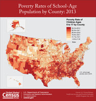
How School-Age Child Poverty in Every County Compares with Prerecession Levels
|
Friday, September 5, 2014
Census Flows Mapper Highlights Labor Force Characteristics of Movers Between Counties
Of the 16.6 million people who lived in a different county one year before, 7.3 million were employed and 1.3 million were unemployed, according to new migration statistics released today by the U.S. Census Bureau. A little over 5 percent of the U.S. population lived in a different county one year earlier.
The County-to-County Migration Flows Tables, which use data collected by the American Community Survey between 2008 and 2012, show how many residents move (flow) from one specific county to another during the course of a year.
“These statistics show the work, occupation and employment status of movers at the time they were surveyed,” said Kin Koerber, a demographer with the Census Bureau’s Journey-to-Work and Migration Statistics Branch. “With the new update, we can see movements of occupation groups from one part of the country to another.”
The release includes new statistics on employment status, work status and occupation characteristics and an update to the online mapping tool Census Flows Mapper. In addition, migration flows from Puerto Rico municipios (county equivalents) to U.S. counties are included for the first time.
Below are a few highlights for all counties in the U.S., which provide an example of the information available in Census Flows Mapper:
Thursday, September 4, 2014
Where Are the Hardest Places to Live in the U.S.?
Annie Lowrey writes in the Times Magazine about the troubles of Clay County, Ky., which by several measures is the hardest place in America to live.
The Upshot came to this conclusion by looking at six data points for each county in the United States: education (percentage of residents with at least a bachelor’s degree), median household income, unemployment rate, disability rate, life expectancy and obesity. We then averaged each county’s relative rank in these categories to create an overall ranking.
The 10 lowest counties in the country, by this ranking, include a cluster of six in the Appalachian Mountains of eastern Kentucky, along with four others in various parts of the rural South.
More from the New York Times.
Monday, July 7, 2014
Half Of The United States Lives In These Counties
Using Census data, we've figured out that half of the United States population is clustered in just the 146 biggest counties out of over 3000.
Read more in Business Insider
Read more in Business Insider
Tuesday, June 3, 2014
Program of Applied Demographics at Cornell
The Program on Applied Demographics (PAD) brings skills in demographics, economics, statistics, data gathering and data analysis together to provide a variety of organizations with data, information and advice. PAD works closely with the New York State Department of Labor, the U.S. Census Bureau and other organizations to assist them in their activities. Examples of PAD's activities can be found here.
PAD is part of the Cornell Population Center, a university-wide program serving 96 affiliates from 24 different departments and is housed in the College of Human Ecology at Cornell University.
Here are county profiles and recent trends for New York State.
PAD is part of the Cornell Population Center, a university-wide program serving 96 affiliates from 24 different departments and is housed in the College of Human Ecology at Cornell University.
Here are county profiles and recent trends for New York State.
Friday, April 25, 2014
The Munson-Nixon Line: Up Close on Baseball’s Borders
From the New York Times:
Steve Rushin of Sports Illustrated has called the line running through Connecticut that separates Yankee fans and Red Sox fans the Munson-Nixon line. Mr. Rushin came up with the name — in honor of the late Yankee catcher Thurman Munson and the retired Red Sox right fielder Trot Nixon — in 2003, and he had to guess where the line ran: “north of New Haven but south of Hartford, running the breadth of central Connecticut.”
We don’t have to guess anymore.
Fans may not list which team they favor on the census, but millions of them do make their preferences public on Facebook. Using aggregated data provided by the company, the New York Times was able to create an unprecedented look at the geography of baseball fandom, going down not only to the county level, as Facebook did in a nationwide map it released a few weeks ago, but also to ZIP codes. We can now clearly see that both Hartford and New Haven are in fact Yankee outposts. We can also determine the precise Chicago neighborhoods where White Sox jerseys stop being welcome and the central California town where the Dodgers cede fan favorite status to the Giants.
Wednesday, February 19, 2014
New York county-to-county migration
Today the Census Bureau released County-to-County flow data based on the 2007-2011 ACS. This year the flows are cross-tabulated with education and income (individual and household). Last year they were cross-tabulated with sex, age, race and Hispanic origin.
More on that release HERE and HERE.
Data can be found through HERE and they have a mapping application where you can find out where people with certain characteristics come from and go to.
See also the data tabular format on a new web page. You can find estimates of the characteristics of people moving in and out of each County (“Overview”) or you can get estimates of the characteristics of people moving between two New York counties.
Thursday, August 29, 2013
Program on Applied Demographics' subcounty profiles for NYS
In addition to the County profiles previously announced, Cornell's Program on Applied Demographics has recently produced booklets with data on towns, cities and villages in NYS. They contain data from the Decennial census, the population estimates program and the ACS. The data is organized by county.
Profiles for the Indian reservations within New York are in a separate booklet together with data on the American Indian population in New York.
All profiles can be downloaded here.
Profiles for the Indian reservations within New York are in a separate booklet together with data on the American Indian population in New York.
All profiles can be downloaded here.
Friday, August 16, 2013
Population of New York State by County, 1790 to 1990
From Empire State Development.
Population counts from the federal Decennial Census of Population. The first Census was taken in 1790 and has been taken every 10 years since that time. Population figures include total resident population as of the given date.
NOTES ON BOUNDARY CHANGES:
Bronx County
- Organized from part of New York in 1914.
Chemung County
- Part taken to form part of Schuyler in 1854.
Essex County
- Part annexed to Hamilton and part of Hamilton annexed in 1915.
Hamilton County
- Part annexed to Essex and part of Essex annexed in 1915.
Kings County
- Part of Queens annexed in 1915.
Nassau County
- Organized from part of Queens in 1899.
New York County
- Parts of Westchester annexed in 1873 and 1895; part taken to form Bronx in 1914.
Queens County
- Part taken to form Nassau in 1899; part annexed to Kings in 1915.
Schuyler County
- Organized from parts of Chemung, Steuben, and Tompkins in 1854.
Steuben County
- Part taken to form part of Schuyler in 1854.
Tompkins County
- Part taken to form part of Schuyler in 1854.
Westchester County
- Parts annexed to New York in 1873 and 1895
Tuesday, April 16, 2013
New Website with Six Decades of Age-Specific Net Migration Estimates
A new database, developed with funding from NIH-NICHD and USDA-ERS, was just released. Richelle Winkler and Kenneth M. Johnson were Co-PI’s on the project. They did the 2000-2010 age specific net migration estimates for all U.S. counties by age-race and sex. The technical documentation for this is available from the website. Here is a link to the first overview of the findings, which was just released as a Carsey Brief.
The coolest part of the new release is a new website at the Applied Population Lab at the Univ of Wisconsin-Madison. It combines their new estimates with similar estimates done by five teams of demographers for the last five decades. So, users have access to six decades of age-specific net migration data for every U.S. county. In addition to being able to download any or all of the data, users can also use simple on-line tools to chart data for up to three counties over six decades or to map the data. Jim Beaudoin at APL UW-M did all the web design for the new site.
This may be invaluable to researchers, planners and policy-makers. Kenneth Johnson suggests you try it— "but be forewarned, it is addictive to data junkies like us."
Wednesday, August 29, 2012
Health Insurance Coverage Estimates for Every County
The U.S. Census Bureau today released 2010 estimates of health insurance coverage for each of the nation’s roughly 3,140 counties. Small Area Health Insurance Estimates (SAHIE) are the only source for single-year estimates of health insurance coverage status for every county in the nation.
These estimates are available by sex, age groups, race and Hispanic origin (for states only), and income-to-poverty ratios. As in past years, the estimates pertain to those younger than 65 as a whole. However, for the first time, there are estimates of coverage at the county level for those in the 50 to 64 age group.
By 2014, changes to the law will extend certain Medicaid benefits to uninsured people falling into specific income groups, and SAHIE estimates will permit users to track the impact of the law on small counties. The estimates also enable local planners to determine, for instance, the counties in which low-income children are most likely to lack health insurance. The mapping tools available on the SAHIE website can also show regional trends in coverage, displaying for instance, that small counties with a high range of uninsured children are mostly in Texas, Nevada and Montana, and small counties with a low range of uninsured are mostly in the Northeast and Midwest.
The new inclusion of the 50 to 64 age category allows tracking of the insurance status of this population, which is more likely to consume health care compared with younger age groups. Knowing the number of uninsured at this older age group allows planners and health care officials to better prepare for the health care needs of this population.
SAHIE is partially funded by the Centers for Disease Control and Prevention (CDC) and others in the health care field. The CDC uses these statistics in support of its National Breast and Cervical Cancer Early Detection Program, providing free cancer screenings to low-income, uninsured women.
“We use SAHIE data to more effectively gauge the level of need for breast and cervical cancer screening in various geographic jurisdictions across the country,” said Marcus Plescia, director of the CDC&8217;s Division of Cancer Prevention and Control in Atlanta. “The information provided by SAHIE data is important to us in program planning and management, targeting and resource allocation decisions and evaluation.”
The estimates are based on statistical models combining data from a variety of sources, including the American Community Survey (ACS), Census Bureau population estimates, administrative records (such as aggregated federal tax returns and Medicaid participation records) and 2000 Census statistics.
At present, SAHIE is the only source of health insurance estimates for all counties. There are no county estimates derived from the Current Population Survey. In September, the Census Bureau will release health insurance coverage estimates for counties with a population of 65,000 or more from the 2011 ACS. The following month, similar estimates will be released for counties with a population of 20,000 or more from the 2009-2011 ACS. Starting next year, the five-year estimates from ACS will include statistics on health insurance coverage for all areas, regardless of size.
Tuesday, August 21, 2012
Not all ZIP code lists by county are alike
I looked for a couple websites that would give out ZIP codes by county. The first two I found were GetZIPS.com and MelissaData.com.
I tend to trust Melissa more.
Looking for ZIP Code 12309, primarily a ZIP Code in Schenectady, I wanted to see if the small portion in Albany County in that ZIP would show up. Yes in Melissa;, no in GetZIPS.
Remember that ZIP Codes are no respecter of county boundaries.
I tend to trust Melissa more.
Looking for ZIP Code 12309, primarily a ZIP Code in Schenectady, I wanted to see if the small portion in Albany County in that ZIP would show up. Yes in Melissa;, no in GetZIPS.
Remember that ZIP Codes are no respecter of county boundaries.
Thursday, July 26, 2012
How to Get Disaster and Drought Assistance
A number of counties are currently being affected by drought. The USDA has crop updates for farmers, as well as information about crop insurance, assistance for livestock losses, and emergency farm loans.
Find drought assistance from the USDA.
Find drought assistance from the USDA.
Wednesday, April 4, 2012
County-to-County Migration Flows
The American Community Survey (ACS) and the Puerto Rico Community Survey (PRCS) ask respondents age 1 year and over whether they lived in the same residence 1 year ago. For people who lived in a different residence, the location of their previous residence is collected.
ACS uses a series of monthly samples to produce estimates. Estimates for geographies of population 65,000 or greater are published annually using these monthly samples.
ACS uses a series of monthly samples to produce estimates. Estimates for geographies of population 65,000 or greater are published annually using these monthly samples.
Thursday, March 15, 2012
Household Income Inequality Within U.S. Counties: 2006-2010
This report [PDF] presents measures of household income inequality for counties in the United States, based on data pooled from 5 years (2006 to 2010) of American Community Survey (ACS) data. For example, the data show that the more unequal counties were also more populous. Thirty-four percent of Americans lived in a county that ranked in the top 20 percent of U.S. counties by Gini index (the Gini index is a measure of income inequality).
In every region, the counties in the most unequal fifth of U.S. counties accounted for a disproportionately large share of that region's population. For example, only 8 percent of Midwestern counties had Gini indexes ranking among the top fifth of U.S. counties, but they contained 26 percent of the region's population. Also, the South region had a disproportionately large number of counties with high income inequality, while counties in the Midwest had lower levels of income inequality. Specifically, 32 percent of the counties in the South had Gini indexes ranking among the top fifth of U.S. counties, while 31 percent of Midwest counties ranked among the bottom fifth of U.S. counties.
In every region, the counties in the most unequal fifth of U.S. counties accounted for a disproportionately large share of that region's population. For example, only 8 percent of Midwestern counties had Gini indexes ranking among the top fifth of U.S. counties, but they contained 26 percent of the region's population. Also, the South region had a disproportionately large number of counties with high income inequality, while counties in the Midwest had lower levels of income inequality. Specifically, 32 percent of the counties in the South had Gini indexes ranking among the top fifth of U.S. counties, while 31 percent of Midwest counties ranked among the bottom fifth of U.S. counties.
Wednesday, November 2, 2011
State & County QuickFacts and USA Counties
State & County QuickFacts provides "Quick, easy access to facts about people, business, and geography".
USA Counties features over 6,300 data items for the United States, States and counties from a variety of sources. Files include data published for 2010 population as well as many other items from the 2010 Census of Population and Housing, the 1990 census, the 1980 census and the 2007, 2002, 1997, and 1992 economic censuses.
Both from the US Census.
Subscribe to:
Comments (Atom)