Showing posts with label states. Show all posts

Tuesday, December 19, 2017

2017’s Most Charitable States

From WalletHub:

Tis the season for giving. And the latest World Giving Index shows that Americans are among the world’s most generous people, ranking No. 5 out of 140 countries. U.S. donors in 2016 gave more than $389 billion to charity, with 72 percent of the funds coming directly from individuals, according to the National Philanthropic Trust.

But Americans do more than reach in their pockets to help others. They also contribute their time — and plenty of it. Nearly 63 million people volunteer in the U.S., serving a combined total of 7.9 billion hours per year, the equivalent of $184 billion of service.

Not everyone is equally selfless, however. In the spirit of inspiring altruism, WalletHub determined the most charitable of the 50 states by comparing them across 14 key indicators of charitable behavior. Our dataset ranges from volunteer rate to share of income donated to share of sheltered homeless.

Friday, April 15, 2016

Gambling Not a Solution to State Revenue Woes

From the Rockefeller Institute:

States turning to gambling as a possible quick fix for revenue woes have often been disappointed with the results, according to a just released study from the Nelson A. Rockefeller Institute of Government, entitled State Revenues From Gambling: Short-Term Relief, Long-Term Disappointment [PDF link].

According to Lucy Dadayan, senior policy analyst at the Institute and principal author of the report, despite the steep declines in tax revenues during the "Great Recession" most states were reluctant to raise taxes on income or sales. As an alternative, she reports, officials in many states turned to taxes on gambling, part of what are often called "sin taxes." In the recession's wake, over a dozen of states have legalized and expanded different forms of gambling activities in the hopes of raising more revenues, despite the fact gambling revenue plays a small role in state budgets, ranging between 2.0 and 2.5 percent of state own-source general revenues in the typical state.

The report demonstrates that tax and fee revenues from gambling activities have softened considerably in recent years, due, in part, to market saturation and industry cannibalization.

Monday, January 11, 2016

Spatial Distribution of Net International Migration


This map shows the states' share of the estimated U.S. net international migration for the period 2010-15, which may be of some use in your accumulated knowledge about migrants. Note this is from the cumulative total table 4 of the Population Estimates Vintage 2015.

Note that the four states with the largest population are also the four states with the largest share of immigrants.

The map was designed by Joe Douglas Francis at Cornell University.


Tuesday, December 22, 2015

North Carolina Becomes 9th State With 10 Million or More People

By adding an average of 281 people per day during the last year, North Carolina’s population crossed the 10 million mark, making the state the ninth in that category, according to U.S. Census Bureau state population estimates released today.
North Carolina’s population gain over the July 1, 2014, to July 1, 2015, period ranked it behind only Texas, Florida, California, Georgia and Washington.
Notably, Florida added more people than California for the first time in nearly a decade. Florida’s gain of 365,703 people also pushed it past 20 million, becoming the third state to reach that milestone. California continued to be the most populous state on July 1, 2015, with 39.1 million, followed by Texas with 27.5 million.
North Dakota was the nation’s fastest-growing state or equivalent over the last year, for the fourth year in a row. Its population increased 2.3 percent, followed by 1.9 percent growth in Colorado, the District of Columbia and Nevada. Each of the 10 fastest-growing states was in the South or West with the exception of North Dakota.
Seven states lost population between July 1, 2014, and July 1, 2015: Illinois

Saturday, October 3, 2015

State and County Migration Data, 2013–2014

The State- and county-level migration data for 2013-2014 for the United States are now available on Tax Stats. These data show the migration between both States and counties in separate datasets. These datasets use the methodological improvements made to SOI’s United States population migration data and are not comparable with prior years. The data include migration flows at the State level, by size of adjusted gross income and age of the primary taxpayer.

Migration data are based on year-to-year address changes reported on individual income tax returns filed with the IRS. The data present migration patterns by State or county for the entire United States and are available for inflows (the number of new residents who moved to a State or county and where they migrated from) and outflows (the number of residents leaving a State or county and where they moved to).

Wednesday, September 2, 2015

Fastest growing occupations

When looking for labor projections, look at the Bureau of Labor Statistics. Here are Fastest growing occupations, 2012 and projected 2022 and Occupations with the most job growth for the same time frame.

For state data, check ProjectionsCentral.com for Short Term Occupational Projections (to 2016) and Long Term Occupational Projections (to 2022).

Tuesday, July 21, 2015

Percent changes in average hourly earnings by state, May 2014 to May 2015

From May 2014 to May 2015, average hourly earnings increased in 45 states and decreased in five states and the District of Columbia. Vermont had the highest percent increase in hourly earnings (5.8 percent). Wyoming had the largest percent decrease (−1.4 percent).

Monday, July 13, 2015

Compare your State’s Economy Against the Rest of the World

The US economy is so big, that the economies of all 50 states are comparable in size to those of entire countries. To illustrate this, howmuch.net used national GDP data from the International Monetary Fund (IMF) and state data from the Bureau of Economic Analysis (BEA) to put together a map that displays a country of comparable size (in terms of GDP) for each US state. All of the countries shown have 2014 GDPs that are roughly equivalent (+/- 10%) to the GDP of the state on which it is shown.


See the methodology and more info at HowMuch.net

Monday, March 23, 2015

State Revenues from Gambling Show Weakness Despite Gambling Expansion

States derive the bulk of gambling-related revenues from three major sources—lotteries, casinos, and racinos. While casinos experienced dramatic growth during the 1990s, that trend shifted downward over the past decade. In recent years, much of the growth has shifted to racinos—hybrids of casinos and racetracks —as more states have approved such facilities. Pari-mutuel betting, once the major source of gambling revenue for states, now represents less than 1.0 percent of such revenue.

When tax revenue weakens during economic downturns, states often consider expanded gambling operations among other options for balancing budgets. That has been no exception during the Great Recession and its aftermath. Since the recession began in December 2007, over a dozen states have enacted various measures to expand gambling.

States’ revenues from gambling showed soft growth at 0.6 percent in fiscal 2014, despite expansion of various gambling activities in recent years. In fiscal 2014, revenue collections from lotteries and racinos grew by 0.6 and 1.5 percent, respectively, while revenue collections from casinos declined by 1.4 percent. The expansion of gambling across the nation created stiff competition for certain regions of the nation and heightened rivalry for the same pool of consumers.

More from the Rockefeller Institute of Government

Friday, January 30, 2015

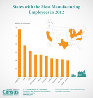
New York State ranks third in Manufacturing Employment for 2012


Manufacturing Employment
Los Angeles Alone Has More Than 100,000 Manufacturing Employees
The Census Bureau has released manufacturing statistics from its 2012 Economic Census at the state, metro area and county levels, as well as for cities and towns, for more than 350 manufacturing industries. These data, referred to as the Geographic Area Series, cover more than 296,000 U.S. manufacturing establishments (NAICS 31-33) within every state and their localities.
“These Geographic Area Series reports are the only source of detailed economic information for more than 15,000 cities, towns and other similar places in the U.S.,” Census Bureau Director John H. Thompson said. “We are pleased that over the course of this year, the Geographic Area Series will be providing for 18 sectors of the economy − economic information for the first time for more than 5,000 small towns. This unique data set is indispensable in assessing the performance of the economy in every corner of the country.”

Friday, October 24, 2014

New York ranks seventh most energy-efficient state

How does your state stack up when it comes to energy efficiency? The nonprofit American Council for an Energy-Efficient Economy (ACEEE) has just issued its eighth annual State Energy Efficiency Scoreboard, which assesses states based on policies that encourage energy savings, efficiency investments and jobs in the clean energy sector. So you can look it up...

The winner for the third straight year is Massachusetts...

The study also rated cities, finding Boston to be the leader in its efforts to encourage better energy use. Portland, New York, San Francisco, Seattle, Austin, Washington, Minneapolis, Chicago and Philadelphia round out the top ten.

More from Daily Kos.

Thursday, September 25, 2014

New census data shows desperate need for health care in red states

Seven of the 11 large metro areas where the uninsured rate was higher than the 14.5 percent national average last year are located in states that refused to expand to Medicaid under the Affordable Care Act. Two are in Florida, three are in Texas, and the others are Atlanta and Charlotte, North Carolina. The metro area with the highest uninsured rate was Miami, at a staggering 25 percent, compared to the national low of 4 percent in greater Boston...

According to the Henry J. Kaiser Family Foundation, those decisions not to expand the program will leave 4.8 million people uninsured. More than 1 million of them live in Texas, 764,000 are in Florida, 409,000 are Georgia residents and 319,000 live in North Carolina.

More from Daily Kos.

Friday, September 19, 2014

Income inequality is taking a toll on state governments

The widening gap between the wealthiest Americans and everyone else has been matched by a slowdown in state tax revenue, according to a report being released Monday by Standard & Poor's.

Even as income for the affluent has accelerated, it's barely kept pace with inflation for most other people. That trend can mean a double-whammy for states: The wealthy often manage to shield much of their income from taxes. And they tend to spend a lower percentage of it than others do, thereby limiting sales tax revenue.

As the growth of tax revenue has slowed, states have faced tensions over whether to raise taxes or cut spending to balance their budgets as required by law.

"Rising income inequality is not just a social issue," said Gabriel Petek, the S&P credit analyst who wrote the report. "It presents a very significant set of challenges for the policymakers."

More from the Skanner.

Wednesday, September 17, 2014

2014′s Most & Least Fair State Tax Systems

With summer ending, the 2014 elections are starting to heat up. And as usual tax policy is a hot button issue as candidates for Governor, state legislatures and other state and local offices from both parties claim their plan is more “fair.” But what does a fair tax system look like? Which states actually have the most fair tax systems?

As a follow up to our 2014 Tax Fairness Survey which focused largely on federal tax policy, WalletHub has analyzed and ranked the 50 states based on the fairness of their state and local tax systems — including income taxes, sales & excise taxes, and property taxes. To rank the states, Wallethub conducted a nationally representative online survey of 1,050 individuals to assess what Americans think a fair state and local tax system looks like. Our analysts then compared what Americans think is fair to data on the real structure of tax systems in all 50 states.

We believe this is the first ever ranking of state and local tax fairness that matches representative data on what Americans think is fair with real data on the structure of state and local tax systems.

See more from Wallethub

Monday, August 18, 2014

Where people were born, by state: an interactive graphic,for 1900-2012

From the New York Times, which charted how Americans have moved between states since 1900. See how your state has changed!


The image of New York as a beacon that attracts all is definitely true for immigrants, but for people born in the United States, the picture is more complicated. With the recent growth in immigration, the percentage of foreign-born residents in New York is approaching Ellis Island days. But domestically, one of the less-noticed trends is the decline in population of blacks born in other states. Since 1980, the population of Southern-born blacks has declined by more than 350,000.

Monday, July 28, 2014

How much do you know about the laws that govern us? And have you ever wanted to know exactly what they say?
The “Laws and Regulations” page at usa.gov is a good place to find out. Get details on recent laws like the Affordable Care Act, or laws that differ from state to state like gun regulations. You can also see bills that have been introduced in Congress and learn how to get involved and contact your elected officials.

Monday, April 28, 2014

Which U.S. States Have the Most (and Least) State Pride?

Don’t mess with Texas, Montana, or Alaska—the residents of these three states are among those with the most state pride, according to a new Gallup poll.

The research company interviewed at least 600 residents in each of the 50 states and asked whether their home was “the best possible state to live in,” “one of the best possible states to live in,” “as good a state as any to live in,” or “the worst possible state to live in.” Montanans and Alaskans responded with the most enthusiasm, with 77 percent of the participants in both states saying theirs is the best, or one of the best, places to live. Utah, Wyoming, and Texas followed with 70, 69, and 68 percent of residents answering the same way.

On the other hand, not every state’s citizens were quite so positive about their home. Leading the states with the lowest levels of pride were Rhode Island (only 18 percent of participants said the Plantation State is the best or one of the best spots to live in America), Illinois (19 percent), and Mississippi (26 percent)>

More from PARADE.

Tuesday, March 25, 2014

HRC Foundation Releases State-By-State Report Detailing LGBT-related Legislation

The Human Rights Campaign Foundation released a comprehensive state-by-state report detailing LGBT-related legislation in 2013, a year marked by huge victories for the LGBT community from statehouses across the nation to the United States Supreme Court. The report indicates that the majority of pro-LGBT legislation came in the form of marriage equality legislation. This is the tenth year HRC has published this comprehensive guide to state legislation affecting LGBT people.

Saturday, March 1, 2014

TOP-RANKED PUBLIC UNIVERSITIES WITH THE BEST ROI: NORTHEASTERN U.S. REGION

The northeastern region is home to many of the nation’s top public universities. This list ranks the top public universities in each state in the northeastern region by their 30 year net return on investment (ROI). The schools are listed in order of lowest to highest 30 yr net ROI for in-state students.
The criteria for inclusion in the list was that each school must be the top ranked school in its state according to U.S. News and World Report.
The purpose of this list is to allow students to compare and contrast the average 30 year net ROI of the top public university in each state for in-state and out-of-state students.

See the list, and the #1 from NYS, from BestValueSchools.

Monday, January 6, 2014

Restless America: state-to-state migration in 2012

From Vizynary:

Approximately 7.1 million Americans moved to another state in 2012. That’s over 2.2% of the U.S. population. The United States has a long history of people picking up and moving their families to other parts of the country, in search of better livelihoods. That same spirit of mobility, a willingness to uproot oneself, seems alive and well today based on the visualization of migration patterns above.

The visualization is a circle cut up into arcs, the light-colored pieces along the edge of the circle, each one representing a state. The arcs are connected to each other by links, and each link represents the flow of people between two states. States with longer arcs exchange people with more states (California and New York, for example, have larger arcs). Links are thicker when there are relatively more people moving between two states. The color of each link is determined by the state that contributes the most migrants, so for example, the link between California and Texas is blue rather than orange, because California sent over 62,000 people to Texas, while Texas only sent about 43,000 people to California. Note that, to keep the graphic clean, I only drew a link between two states if they exchanged at least 10,000 people.