Human interference with the climate system is occurring, and climate change poses risks for human and natural systems... The assessment of impacts, adaptation, and vulnerability... evaluates how patterns of risks and potential benefits are shifting due to climate change. It considers how impacts and risks related to climate change can be reduced and managed through adaptation and mitigation. The report assesses needs, options, opportunities, constraints, resilience, limits, and other aspects associated with adaptation.
Climate change involves complex interactions and changing likelihoods of diverse impacts. A focus on risk, which is new in this report, supports decision-making in the context of climate change, and complements other elements of the report. People and societies may perceive or rank risks and potential benefits differently, given diverse values and goals.
Compared to past reports, the WGII AR5 assesses a substantially larger knowledge base of relevant scientific, technical, and socioeconomic literature. Increased literature has facilitated comprehensive assessment across a broader set of topics and sectors, with expanded coverage of human systems, adaptation, and the ocean.
Summary for Policymakers
Final Drafts Downloads
Friday, April 4, 2014

Thursday, April 3, 2014
See where every execution has taken place since 1977, in one map
From the Washington Post, where the graphic resides:
A majority of Americans support the death penalty, but their ranks have been shrinking for 17 years, according to a new Pew Research Center poll.
As of 2013, 55 percent of adults say they back the death penalty for convicted murderers, while 37 percent say they do not. That’s a sizable difference from two years earlier, when support won out with 62 percent with 31 percent opposed. A majority of whites, Republicans and independents support the death penalty, while majorities of Hispanics, blacks and Democrats do not.
A majority of Americans support the death penalty, but their ranks have been shrinking for 17 years, according to a new Pew Research Center poll.
As of 2013, 55 percent of adults say they back the death penalty for convicted murderers, while 37 percent say they do not. That’s a sizable difference from two years earlier, when support won out with 62 percent with 31 percent opposed. A majority of whites, Republicans and independents support the death penalty, while majorities of Hispanics, blacks and Democrats do not.
Wednesday, April 2, 2014
PeopleForBikes
PeopleForBikes is the movement to improve bicycling in the U.S. By collaborating with millions of individual riders, businesses, community leaders and elected officials, it is uniting Americans to boost bicycling on a national level for results that can be seen locally. Here’s what the organization has accomplished in 2013.
Tuesday, April 1, 2014
Don't Be Fooled: Beware of Washington State Mudslide Charity Scams
In the wake of the deadly mudslide in Washington State, the Federal Trade Commission, the nation’s consumer protection agency, reminds consumers that scams often follow disasters. If you’re asked to make a charitable donation to help people in disaster-affected areas, before you give, be sure your donations are going to a reputable organization that will use the money as promised.
Unfortunately, legitimate charities face competition from scammers who either collect for a charity that doesn't exist or aren't honest about how their “charity” will use the money you give. Like legitimate charities, they might appeal for donations in person, by phone or mail, by e-mail, on websites, or on social networking sites. For more information, read the FTC consumer blog post, Helping victims of the Washington State mudslide — Make sure your donations count and, for a list of groups that can help you research a charity, go to Charity Scams.
Unfortunately, legitimate charities face competition from scammers who either collect for a charity that doesn't exist or aren't honest about how their “charity” will use the money you give. Like legitimate charities, they might appeal for donations in person, by phone or mail, by e-mail, on websites, or on social networking sites. For more information, read the FTC consumer blog post, Helping victims of the Washington State mudslide — Make sure your donations count and, for a list of groups that can help you research a charity, go to Charity Scams.
Monday, March 31, 2014
FTC Chairwoman Releases 2013 Annual Highlights
Federal Trade Commission Chairwoman Edith Ramirez released the agency’s 2013 Annual Highlights today at the Spring Meeting of the American Bar Association’s Section of Antirust Law in Washington emphasizing the agency’s work to protect consumers and promote competition during the past calendar year.
“The hallmark of our work has been, and will continue to be, our ability to adapt established tools – law enforcement, policy initiatives and education – to address economic challenges and technological advances that Congress could never have imagined when it created the FTC,” said Ramirez in her Highlights message.
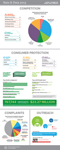
The agency’s Enforcement Highlights address a range of law enforcement actions in industries including health care, technology, and energy and the environment. Promoting competition in the health care and pharmaceutical industries that reduces costs to consumers remains a top priority for the Commission and among the most notable accomplishments last year in this area, the FTC obtained two Supreme Court victories (FTC v. Actavis Inc., and FTC v. Phoebe Putney).
Focusing on the technology sector, the agency took its first actions involving mobile cramming and the Internet of Things. Law enforcement to stop consumer fraud continued to be a high priority for the agency along with its complementary order enforcement program. The FTC’s actions resulted in redress orders of more than $297 million and civil penalty orders of $20 million.
Friday, March 28, 2014
When water doesn't boil
Water boils at 212° Fahrenheit (100° Celsius) at standard pressure. If you take a few drops of water and toss them into a frying pan at 212° Fahrenheit or above, therefore, the water will start to boil. The water makes a sizzling sound as it rapidly evaporates and steam shoots out of the pan.
But sometimes, that doesn't happen. Sometimes, water droplets form in the pan and remain there, not boiling off.
Now I Know asks Why is that?
But sometimes, that doesn't happen. Sometimes, water droplets form in the pan and remain there, not boiling off.
Now I Know asks Why is that?
Thursday, March 27, 2014
2013 County and Economic Development Regions Population Estimates
On March 27th, 2014 the U.S. Census Bureau released the County total population estimates for July 1, 2013. This document from the Program on Applied Demographics at Cornell University highlights some of these estimates and results when aggregating into the Economic Development Regions. The change in population is split in change due to natural increase and due to net-migration. Natural increase is the difference between the number of births and the number of deaths, net-migration the result of people moving in- and out of a region.
Wednesday, March 26, 2014
Mining, Quarrying, Oil and Gas Extraction Booming, per First Results from Census Bureau’s 2012 Economic Census

The mining, quarrying, and oil and gas extraction sector of the economy showed tremendous growth from 2007 to 2012 as the number of establishments rose by 26.4 percent, according to the 2012 Economic Census Advance Report released today by the U.S. Census Bureau.
These results provide the first comprehensive look at the U.S. economy since the 2007 recession. The economic census is the most authoritative and comprehensive source of information about U.S. businesses from the national to the local level. It provides the foundation and benchmark for gross domestic product, monthly retail sales, as well as other indicators of economic performance.
“The economic census is one of the Commerce Department’s most valuable data resources,” U.S. Secretary of Commerce Penny Pritzker said. “By providing a close-up look at millions of U.S. companies in thousands of industries, the economic census is an important tool that informs policy at the local, state and national level, and helps businesses make critical decisions that drive economic growth and job creation. At the Department of Commerce, one of the top priorities of our ‘Open for Business Agenda’ is to make our data easier to access and understand so that it can continue enabling startups, moving markets, protecting life and property, and powering both small and large businesses across the country.”
Revenue for mining, quarrying, and oil and gas extraction grew 34.2 percent to $555.2 billion from 2007 to 2012. It also was among the fastest growers in employment as the number of employees rose 23.3 percent to 903,641.
“The growth shown by the 2012 Economic Census in the mining, quarrying, and oil and gas extraction sector supports the population growth we see in parts of the Great Plains,” Census Bureau Director John H. Thompson said. “These data drive our understanding of the economy, and when considered in context of our demographic data provide insight into growth trends.”
The 2012 Economic Census Advance Report is the first in a series of industry and geographic area data products.
Tuesday, March 25, 2014
HRC Foundation Releases State-By-State Report Detailing LGBT-related Legislation
The Human Rights Campaign Foundation released a comprehensive state-by-state report detailing LGBT-related legislation in 2013, a year marked by huge victories for the LGBT community from statehouses across the nation to the United States Supreme Court. The report indicates that the majority of pro-LGBT legislation came in the form of marriage equality legislation. This is the tenth year HRC has published this comprehensive guide to state legislation affecting LGBT people.
Monday, March 24, 2014
Population Bracketology
Test your knowledge of the relative populations of different geographic areas by participating in the U.S. Census Bureau’s version of “March Madness.” The Census Bureau’s Population Bracketology is an interactive data visualization allowing you to fill out your own bracket based on comparisons of state and metro area population. The objective is to pick the larger population between two metro areas or states and see how close you can come to a perfect score of 63. At the end, visitors can mouse over the choices to see the actual population numbers or view the data table.
The population statistics used in the matchups come from the 2012 population estimates. Other data visualizations can be viewed in the Census Bureau’s online gallery.
The population statistics used in the matchups come from the 2012 population estimates. Other data visualizations can be viewed in the Census Bureau’s online gallery.
Saturday, March 22, 2014
Teaching Kids About Taxes: What Are They and Why Do We Pay Them
It’s that time of year when adults are getting paperwork organized and talking about taxes. Kids may be wondering what all the fuss is about. Here is a lesson plan for grades 3 - 5 that can be used to explain what income, property, and sales taxes are and why we pay them.
The IRS has a comprehensive website for teachers and students from middle school through college.
The IRS has a comprehensive website for teachers and students from middle school through college.
Friday, March 21, 2014
Local government data in NYS
Find information on the fiscal health of your communities and schools, the property tax cap and state spending and payments from the Office of the State Comptroller.
Thursday, March 20, 2014
Alzheimer's Disease: 2014 Facts and Figures
The Alzheimer's Association 2014 Alzheimer's Disease Facts and Figures report released this week reveals startling statistics on the ever-growing impact of Alzheimer's disease on our nation, including new information on growing death rates, the cost of the disease and the disproportionate burden of Alzheimer's disease on women.
"Despite being the nation's biggest health threat, Alzheimer's disease is still largely misunderstood. Everyone with a brain – male or female, family history or not – is at risk for Alzheimer's."
– Angela Geiger, Alzheimer's Association chief strategy officer
Unless something is done to change the course of the disease, there could be as many as 16 million Americans living with Alzheimer's in 2050, at a cost of $1.2 trillion (in current dollars). This video reveals more staggering facts from this year's report.
"Despite being the nation's biggest health threat, Alzheimer's disease is still largely misunderstood. Everyone with a brain – male or female, family history or not – is at risk for Alzheimer's."
– Angela Geiger, Alzheimer's Association chief strategy officer
Unless something is done to change the course of the disease, there could be as many as 16 million Americans living with Alzheimer's in 2050, at a cost of $1.2 trillion (in current dollars). This video reveals more staggering facts from this year's report.
Wednesday, March 19, 2014
U.S. Agricultural Trade Data
From USDA:
U.S. trade data are collected by U.S. Department of Homeland Security, U.S. Customs and Border Protection and compiled and distributed by the U.S. Department of Commerce, U.S. Census Bureau using the United States' Harmonized Tariff Schedule (HTS) of 10-digit codes. Updated trade data are released monthly by the Census Bureau.
Foreign Agricultural Trade of the United States (FATUS) is a standard USDA aggregation of several thousand HTS codes into 213 agricultural groups most used by the public. This data product presents summary tables of FATUS data for U.S. merchandise trade, U.S. agricultural trade, value of high-value and bulk commodities, and top country export destinations and import sources for total U.S. agricultural trade.
Trade data are presented for three different time periods.
Monthly
Latest U.S. Agricultural Trade Data: Most current year-to-date, monthly data for total agricultural trade
U.S. Agricultural Trade Data Update: Most current year-todate, monthly data with commodity level detail
Fiscal Year: Annual (Oct.-Sept.) total trade and total agricultural trade
Calendar Year: Annual (Jan.-Dec.) total trade and total agricultural trade
U.S. trade data are collected by U.S. Department of Homeland Security, U.S. Customs and Border Protection and compiled and distributed by the U.S. Department of Commerce, U.S. Census Bureau using the United States' Harmonized Tariff Schedule (HTS) of 10-digit codes. Updated trade data are released monthly by the Census Bureau.
Foreign Agricultural Trade of the United States (FATUS) is a standard USDA aggregation of several thousand HTS codes into 213 agricultural groups most used by the public. This data product presents summary tables of FATUS data for U.S. merchandise trade, U.S. agricultural trade, value of high-value and bulk commodities, and top country export destinations and import sources for total U.S. agricultural trade.
Trade data are presented for three different time periods.
Monthly
Latest U.S. Agricultural Trade Data: Most current year-to-date, monthly data for total agricultural trade
U.S. Agricultural Trade Data Update: Most current year-todate, monthly data with commodity level detail
Fiscal Year: Annual (Oct.-Sept.) total trade and total agricultural trade
Calendar Year: Annual (Jan.-Dec.) total trade and total agricultural trade
Tuesday, March 18, 2014
Millennials in Adulthood: Detached from Institutions, Networked with Friends
The Millennial generation is forging a distinctive path into adulthood. Now ranging in age from 18 to 331, they are relatively unattached to organized politics and religion, linked by social media, burdened by debt, distrustful of people, in no rush to marry— and optimistic about the future.
They are also America’s most racially diverse generation. In all of these dimensions, they are different from today’s older generations. And in many, they are also different from older adults back when they were the age Millennials are now.
Read more from the Pew Research Center.
They are also America’s most racially diverse generation. In all of these dimensions, they are different from today’s older generations. And in many, they are also different from older adults back when they were the age Millennials are now.
Read more from the Pew Research Center.
Monday, March 17, 2014
Women’s Lives and Challenges: Equality and Empowerment since 2000
From the Institute for Child, Youth, and Family Policy
Promoting gender equality and empowering women is one of the eight Millennium Development Goals (MDGs). The MDGs explicitly recognize that gender equality and women’s empowerment are not only human rights, but also play a powerful role in promoting development and reducing poverty. When women have the same opportunities, access to resources, and life choices as men, the benefits extend far beyond women themselves. As women work to strengthen their families and communities, they foster the education and health of the next generation, hasten economic growth, and strengthen public and private institutions.
A wealth of research has documented the inequities that women face from their earliest years and in every facet of
their lives, including in education, employment, marriage, parenthood, and political participation. Women also face
unique challenges, including meeting their reproductive health needs and the threat of gender-based violence.
Overcoming these challenges and empowering women to fulfill their potential as equal members of society requires
profound changes in attitudes, roles, and behaviors inside the home, at the workplace, and in the community. This report assesses the progress made toward gender equality and women’s empowerment since the MDGs were adopted in 2000. It summarizes findings from 95 surveys conducted by MEASURE DHS in 47 countries from 2000 to 2011. While the largest group of countries comes from sub-Saharan Africa, every region of the developing world is represented.
Promoting gender equality and empowering women is one of the eight Millennium Development Goals (MDGs). The MDGs explicitly recognize that gender equality and women’s empowerment are not only human rights, but also play a powerful role in promoting development and reducing poverty. When women have the same opportunities, access to resources, and life choices as men, the benefits extend far beyond women themselves. As women work to strengthen their families and communities, they foster the education and health of the next generation, hasten economic growth, and strengthen public and private institutions.
A wealth of research has documented the inequities that women face from their earliest years and in every facet of
their lives, including in education, employment, marriage, parenthood, and political participation. Women also face
unique challenges, including meeting their reproductive health needs and the threat of gender-based violence.
Overcoming these challenges and empowering women to fulfill their potential as equal members of society requires
profound changes in attitudes, roles, and behaviors inside the home, at the workplace, and in the community. This report assesses the progress made toward gender equality and women’s empowerment since the MDGs were adopted in 2000. It summarizes findings from 95 surveys conducted by MEASURE DHS in 47 countries from 2000 to 2011. While the largest group of countries comes from sub-Saharan Africa, every region of the developing world is represented.
Friday, March 14, 2014
The placebo effect
The placebo effect is a real phenomenon, first identified in the 1950s and studied ever since, with sometimes surprising results. Take, for example, a 2008 study conducted by a team led by Dan Ariely, a behavioral economist at Duke University. Ariely and company gathered 82 people and gave them electric shocks in their wrists. Then, each of the test subjects were given one of two pills, shocked again, and asked to compare the pre-pill pain to the post-pill discomfort. Of the first group, 85% said the pill reduced the pain. On the other hand, only 61% of the second group said that the pill did its job. Whatever the researchers gave their "patients" worked -- but the first pill clearly worked better.
It shouldn't surprise you that some of these test subjects received placebos. That, however, is not the case. All of the test subjects received placebos, and on top of that, both groups received the exact thing -- sugar pills of identical size, shape, etc. So why did the first group feel less pain than the second?
SEE the answer at Now I Know.
It shouldn't surprise you that some of these test subjects received placebos. That, however, is not the case. All of the test subjects received placebos, and on top of that, both groups received the exact thing -- sugar pills of identical size, shape, etc. So why did the first group feel less pain than the second?
SEE the answer at Now I Know.
Wednesday, March 12, 2014
Data brokers and what they know about you
Check out the 60 Minutes piece last week on data brokers? They have a LOT of info on you.
See also 60 Minutes Overtime; the first and third segments are about the topic.
See also 60 Minutes Overtime; the first and third segments are about the topic.
Tuesday, March 11, 2014
Rising Costs Hitting Homeowners & Renters Across New York State
Housing costs in New York rose sharply relative to income from 2000 to 2012, with more than half of renters and more than a third of homeowners paying at least 30 percent of their 2012 income for a place to live, according to a report released by State Comptroller Thomas P. DiNapoli.
“Regardless of where they live, more New Yorkers are feeling pinched by rising housing costs,”DiNapoli said. “When half your income goes to pay for a place to live, you are going to be stretched thin on other every day purchases. This unfortunate trend has troubling implications for our economic growth and for New Yorkers’ quality of life.”
“Regardless of where they live, more New Yorkers are feeling pinched by rising housing costs,”DiNapoli said. “When half your income goes to pay for a place to live, you are going to be stretched thin on other every day purchases. This unfortunate trend has troubling implications for our economic growth and for New Yorkers’ quality of life.”
Monday, March 10, 2014
Earthquakes Today website
You may have heard about the magnitude 6.9 earthquake in the Pacific Ocean, off the coast of Eureka, CA. But did you know that, in the past 24 hours (as of this writing) there were 5.0+ magnitude quakes in Burma, Columbia, Indonesia, and Mexico?
Check out Earthquakes Today.
Check out Earthquakes Today.
There are around 500,000 earthquakes each year. 100,000 of these can actually be felt. The largest earthquake ever recorded was a magnitude 9.5 (Mw) in Chile on May 22, 1960. The world's deadliest recorded earthquake occurred in 1556 in central China. It struck a region where most people lived in caves carved from soft rock. These dwellings collapsed during the earthquake, killing an estimated 830,000 people.
Friday, March 7, 2014
These 9 Maps Should Absolutely Outrage Southerners
Look, there are lots of things to love about the South. It's clean and quiet. There's delicious food, good people and often amazing weather. But that's exactly why it makes us so sad to think about all the ways in which the region is struggling today.
First off, poverty rates are a lot higher in the South.
More from HuffPo.
First off, poverty rates are a lot higher in the South.
More from HuffPo.
Thursday, March 6, 2014
Who Has Speedy Internet in the USA?
Internet speeds are so slow in the USA. But what about within the USA? Not surprisingly, they vary a great deal.
Not only do they vary but how they vary tells us some important things about factors that go beyond monopolies. One good source of information is this article from last year in Gizmodo which breaks the country down by congressional districts and then cross-references that data with income and population density.
One thing pretty clearly are the higher rates in areas of greatest population density. Montana seems to be in a particularly sad place.
More from Talking Points Memo.
Not only do they vary but how they vary tells us some important things about factors that go beyond monopolies. One good source of information is this article from last year in Gizmodo which breaks the country down by congressional districts and then cross-references that data with income and population density.
One thing pretty clearly are the higher rates in areas of greatest population density. Montana seems to be in a particularly sad place.
More from Talking Points Memo.
Wednesday, March 5, 2014
What is Start-Up NY? Who is eligible? What are the benefits?
Ten months after Gov. Andrew M. Cuomo announced Start-Up NY, which offers 10 years of broad-based tax savings for companies that locate on or near college campuses, school and state officials say the program is generating considerable interest from the business community.
The governor touts Start-Up NY as an economic-development stimulus program that puts New York – upstate in particular – on an even footing with other states that have more business-friendly reputations.
Colleges here and across the state are awaiting formal approval of their tax-free zone boundaries, with an announcement from the state expected soon. But they’re already marketing Start-Up NY to potential partners...
Start-Up NY is meant to encourage start-up companies – or new divisions spun off from existing companies – to hire new employees and set up shop in a zone connected to a college.
The program’s rules ensure the jobs aren't shifted from somewhere else, the benefits go to new hires and the companies receiving the tax breaks have a connection to the schools.
But economic-development experts say it’s hard to say whether any of the tax-incentive programs introduced by the state have had a significant economic impact in New York, while critics say the program rewards new companies at the expense of existing companies.
More from the Buffalo News.
The governor touts Start-Up NY as an economic-development stimulus program that puts New York – upstate in particular – on an even footing with other states that have more business-friendly reputations.
Colleges here and across the state are awaiting formal approval of their tax-free zone boundaries, with an announcement from the state expected soon. But they’re already marketing Start-Up NY to potential partners...
Start-Up NY is meant to encourage start-up companies – or new divisions spun off from existing companies – to hire new employees and set up shop in a zone connected to a college.
The program’s rules ensure the jobs aren't shifted from somewhere else, the benefits go to new hires and the companies receiving the tax breaks have a connection to the schools.
But economic-development experts say it’s hard to say whether any of the tax-incentive programs introduced by the state have had a significant economic impact in New York, while critics say the program rewards new companies at the expense of existing companies.
More from the Buffalo News.
Tuesday, March 4, 2014
Security data analysis behind the times
From Search Security:
Security vendors often claim that attackers behave in unpredictable ways, but two of the researchers behind Verizon's annual Data Breach Investigations Report (DBIR) believe vendors can't spot emerging attack trends because they don't use modern data analysis techniques.
Damage caused by simple attacks, slow detection
For all the industry discussion about the evolution of so-called advanced cyberattacks, data ... indicates a select few attack types are responsible for the majority of last year's reported breaches. Despite that consistency, the majority of organizations fail to identify breaches until months after the initial compromise.
Security vendors often claim that attackers behave in unpredictable ways, but two of the researchers behind Verizon's annual Data Breach Investigations Report (DBIR) believe vendors can't spot emerging attack trends because they don't use modern data analysis techniques.
Damage caused by simple attacks, slow detection
For all the industry discussion about the evolution of so-called advanced cyberattacks, data ... indicates a select few attack types are responsible for the majority of last year's reported breaches. Despite that consistency, the majority of organizations fail to identify breaches until months after the initial compromise.
Monday, March 3, 2014
IMF study finds inequality is damaging to economic growth
From The Guardian:
The International Monetary Fund has backed economists who argue that inequality is a drag on growth in a discussion paper [PDF] that has also dismissed rightwing theories that efforts to redistribute incomes are self-defeating.
The Washington-based organisation, which advises governments on sustainable growth, said countries with high levels of inequality suffered lower growth than nations that distributed incomes more evenly.
Backing analysis by the Keynesian economist and Nobel prizewinner Joseph Stiglitz, it warned that inequality can also make growth more volatile and create the unstable conditions for a sudden slowdown in GDP growth.
And in what is likely to be viewed as its most controversial conclusion, the IMF said analysis of various efforts to redistribute incomes showed they had a neutral effect on GDP growth.
The International Monetary Fund has backed economists who argue that inequality is a drag on growth in a discussion paper [PDF] that has also dismissed rightwing theories that efforts to redistribute incomes are self-defeating.
The Washington-based organisation, which advises governments on sustainable growth, said countries with high levels of inequality suffered lower growth than nations that distributed incomes more evenly.
Backing analysis by the Keynesian economist and Nobel prizewinner Joseph Stiglitz, it warned that inequality can also make growth more volatile and create the unstable conditions for a sudden slowdown in GDP growth.
And in what is likely to be viewed as its most controversial conclusion, the IMF said analysis of various efforts to redistribute incomes showed they had a neutral effect on GDP growth.
Saturday, March 1, 2014
TOP-RANKED PUBLIC UNIVERSITIES WITH THE BEST ROI: NORTHEASTERN U.S. REGION
The northeastern region is home to many of the nation’s top public universities. This list ranks the top public universities in each state in the northeastern region by their 30 year net return on investment (ROI). The schools are listed in order of lowest to highest 30 yr net ROI for in-state students.
The criteria for inclusion in the list was that each school must be the top ranked school in its state according to U.S. News and World Report.
The purpose of this list is to allow students to compare and contrast the average 30 year net ROI of the top public university in each state for in-state and out-of-state students.
See the list, and the #1 from NYS, from BestValueSchools.
The criteria for inclusion in the list was that each school must be the top ranked school in its state according to U.S. News and World Report.
The purpose of this list is to allow students to compare and contrast the average 30 year net ROI of the top public university in each state for in-state and out-of-state students.
See the list, and the #1 from NYS, from BestValueSchools.
Friday, February 28, 2014
New Internet Domain Extensions: Don't Get Blinded by the Sunrise or Run Over by the Landrush
2014 is going to be a landmark year for the Internet as the oldest and most basic form of user online navigation gets a major overhaul. The domain names that marketers and end users have relied on since the Internet's inception—extensions like .com, .net, and .org—will no longer be the only game in town. New generic top-level domains (gTLDs), including extensions such as .app, .sports, .club, .healthcare and many more, have already started to launch.
However, bringing those new extensions to market is more complicated than slapping on a price tag and hanging a for sale sign. It's been a multiyear process already; and, despite some hiccups, the organization that governs the Internet and is managing the rollout, http://newgtlds.icann.org/en ICANN, has tried to make it fair for everyone involved. Accordingly, introducing domains under a new extension is a multistep process that's designed to include protections for trademark holders and give average users a fair shake at getting the names they want.
Every marketer should understand the two important phases under this process: the Sunrise and the Landrush periods. ICANN mandates that a Sunrise period lasting at least 30 days must take place for every new domain extension that launches. During that timeframe, trademark holders are given an opportunity to claim domains that are associated with their marks before anyone else is able to register them. If multiple parties are seeking the same domain, disputes will be arbitrated or will go to auction at the end of the Sunrise period.
Read more from MarketingProfs.
However, bringing those new extensions to market is more complicated than slapping on a price tag and hanging a for sale sign. It's been a multiyear process already; and, despite some hiccups, the organization that governs the Internet and is managing the rollout, http://newgtlds.icann.org/en ICANN, has tried to make it fair for everyone involved. Accordingly, introducing domains under a new extension is a multistep process that's designed to include protections for trademark holders and give average users a fair shake at getting the names they want.
Every marketer should understand the two important phases under this process: the Sunrise and the Landrush periods. ICANN mandates that a Sunrise period lasting at least 30 days must take place for every new domain extension that launches. During that timeframe, trademark holders are given an opportunity to claim domains that are associated with their marks before anyone else is able to register them. If multiple parties are seeking the same domain, disputes will be arbitrated or will go to auction at the end of the Sunrise period.
Read more from MarketingProfs.
Tuesday, February 25, 2014
Monday, February 24, 2014
This Is the Williamsburg of Your City: A Map of Hip America
What is your city's Williamsburg? What's its hippest—or formerly hippest—or sometimes just youngest—neighborhood, the one with the art galleries and the boutiques and the lines for brunch? (And what, for that matter, is its Bushwick, or "Next Williamsburg"?) If you don't know off the top of your head, don't worry. Today, we present to you the results—tabulated and mapped.
The Williamsburg of/is/(and its Bushwick is)
Albany, N.Y./Center Square/-
Buffalo, N.Y./Elmwood/Allentown
Hudson, N.Y./Warren St./-
More from Gawker.
The Williamsburg of/is/(and its Bushwick is)
Albany, N.Y./Center Square/-
Buffalo, N.Y./Elmwood/Allentown
Hudson, N.Y./Warren St./-
More from Gawker.
Friday, February 21, 2014
How We Won—and Lost—the War on Poverty, in 6 Charts
President Lyndon B. Johnson announced a "war on poverty" in America in his State of the Union address on January 8, 1964. "This administration today, here and now, declares unconditional war on poverty in America," he said. "It will not be a short or easy struggle, no single weapon or strategy will suffice, but we shall not rest until that war is won. The richest nation on Earth can afford to win it. We cannot afford to lose it." The aim of the war, he said would be to "cure" and "prevent" poverty.
Johnson's administration went on to design "Great Society" initiatives, including a permanent food stamp program, Medicare and Medicaid, Head Start, which provides early education to low-income kids, and increased funding to public schools.
The war on poverty helped raise millions above the poverty line. During Johnson's years in office, the poverty rate dropped from 23 percent to 12 percent.
But where do we stand today? The government's official measure of poverty shows that poverty has actually increased slightly since the Johnson administration, rising from 14.2 percent in 1967 to 15 percent in 2012.
But those numbers aren't quite accurate...
More from Mother Jones.
Johnson's administration went on to design "Great Society" initiatives, including a permanent food stamp program, Medicare and Medicaid, Head Start, which provides early education to low-income kids, and increased funding to public schools.
The war on poverty helped raise millions above the poverty line. During Johnson's years in office, the poverty rate dropped from 23 percent to 12 percent.
But where do we stand today? The government's official measure of poverty shows that poverty has actually increased slightly since the Johnson administration, rising from 14.2 percent in 1967 to 15 percent in 2012.
But those numbers aren't quite accurate...
More from Mother Jones.
Thursday, February 20, 2014
Magnets for Migrants: States with the Highest Domestic Migration Rates, 2012-13
The mobility rate of Americans has plunged over the past few decades, falling to historic lows in the aftermath of the Great Recession. Nevertheless, Americans are still moving and some states are attracting more movers than others, according to the most recent estimates from the Census Bureau. Here are the states, ranked from highest to lowest, with positive rates of net domestic migration (meaning more U.S. residents moved into the state than out of the state per 1,000 population) between July 1, 2012 and June 30, 2013...
1. North Dakota
2. District of Columbia
3. Colorado
4. South Carolina
5. South Dakota
6. Montana
7. Florida
8. Nevada
9. Wyoming
10. Texas
11. Arizona
12. North Carolina
13. Oklahoma
14. Delaware
15. Idaho
16. Oregon
17. Washington
18. Tennessee
19. Utah
20. Virginia
21. Iowa
22. Alabama
Among the 29 states with negative domestic migration rates (meaning more U.S. residents are moving out of the state than into the state per 1,000 population) Alaska had the fastest rate of outflow between 2012 and 2013, followed by New York, Illinois, New Jersey, and New Mexico.
Find great stats from the New Strategist.
1. North Dakota
2. District of Columbia
3. Colorado
4. South Carolina
5. South Dakota
6. Montana
7. Florida
8. Nevada
9. Wyoming
10. Texas
11. Arizona
12. North Carolina
13. Oklahoma
14. Delaware
15. Idaho
16. Oregon
17. Washington
18. Tennessee
19. Utah
20. Virginia
21. Iowa
22. Alabama
Among the 29 states with negative domestic migration rates (meaning more U.S. residents are moving out of the state than into the state per 1,000 population) Alaska had the fastest rate of outflow between 2012 and 2013, followed by New York, Illinois, New Jersey, and New Mexico.
Find great stats from the New Strategist.
Wednesday, February 19, 2014
New York county-to-county migration
Today the Census Bureau released County-to-County flow data based on the 2007-2011 ACS. This year the flows are cross-tabulated with education and income (individual and household). Last year they were cross-tabulated with sex, age, race and Hispanic origin.
More on that release HERE and HERE.
Data can be found through HERE and they have a mapping application where you can find out where people with certain characteristics come from and go to.
See also the data tabular format on a new web page. You can find estimates of the characteristics of people moving in and out of each County (“Overview”) or you can get estimates of the characteristics of people moving between two New York counties.
More on that release HERE and HERE.
Data can be found through HERE and they have a mapping application where you can find out where people with certain characteristics come from and go to.
See also the data tabular format on a new web page. You can find estimates of the characteristics of people moving in and out of each County (“Overview”) or you can get estimates of the characteristics of people moving between two New York counties.
Tuesday, February 18, 2014
Looking for Number of Waterfront Homes in the US
From the BUSLIB listserv:
The American Housing Survey may be of use; latest is for 2011. There are links to AFF, but searching is cumbersome.
For 2009, though, the National Summary Report and Tables is in pdf - 175 pages. Much more direct.
The American Housing Survey may be of use; latest is for 2011. There are links to AFF, but searching is cumbersome.
For 2009, though, the National Summary Report and Tables is in pdf - 175 pages. Much more direct.
Monday, February 17, 2014
Marrying Older, But Sooner?
The age when Americans marry for the first time has risen to its highest point since the 1950s. Although true, there is more to the story. With life expectancy increasing, Americans today are actually marrying sooner in their lifetime, despite marrying at older ages.
Although it is common to use the 1950s as a comparison period, doing so exaggerates how much the age at marriage has really risen . Looking at trends since 1890 reveals a U-shaped curve in which the 1950s and 1960s stand out as the exception for marriage, not the norm (estimates for these two decades are not significantly different from one another).
By the end of the 19th century, men married for the first time at 26 years old, three years later than they did in the decade following the Second World War. By 1900 their age at marriage began falling, and it took a full century before returning to its 1890 level. For women, it took 90 years. The idea then that our great-great-grandparents married when they were little older than teenagers is little more than myth.
More from the US Census.
Although it is common to use the 1950s as a comparison period, doing so exaggerates how much the age at marriage has really risen . Looking at trends since 1890 reveals a U-shaped curve in which the 1950s and 1960s stand out as the exception for marriage, not the norm (estimates for these two decades are not significantly different from one another).
By the end of the 19th century, men married for the first time at 26 years old, three years later than they did in the decade following the Second World War. By 1900 their age at marriage began falling, and it took a full century before returning to its 1890 level. For women, it took 90 years. The idea then that our great-great-grandparents married when they were little older than teenagers is little more than myth.
More from the US Census.
Friday, February 14, 2014
The science behind a happy relationship
Regardless of how happy you are in a current relationship (and trust us, you'll find some fascinating facts on how marriage and kids can affect your happiness levels at different stages)--the main takeaway is that there are small changes you can make in your interactions that can boost your relationship satisfaction for the long run.
See the infographic from Happify.
See the infographic from Happify.
Thursday, February 13, 2014
Where in the U.S. will you find the most “pleasant” days in a year?
“Pleasant” here means the mean temperature was between (55° F and 75° F), the minimum temperature was above 45° F, the maximum temperature was below 85° F and there was no significant precipitation or snow depth.
More from Kellegous.
More from Kellegous.
Wednesday, February 12, 2014
New York State and energy
From HERE.
In 2010, New York was the eighth largest energy consumer in the United States, but, due in part to its widely used mass transportation systems, it had the second lowest energy consumption per capita after Rhode Island.
The Marcellus shale, which underlies southwestern New York, is estimated to hold at least 141 trillion cubic feet in technically recoverable natural gas.
The 2,353-megawatt Robert Moses Niagara hydroelectric power plant was the fourth largest hydroelectric power plant in the United States in 2010 and, in 2011, New York produced more hydroelectric power than any other State east of the Rocky Mountains.
New York's Renewable Portfolio Standard requires that 30 percent of electricity come from renewable energy resources by 2015; in 2011, 24 percent of electricity came from renewable energy resources.
In 2011, New York had the fourth highest average electricity prices in the United States.
More than half of New York households (53 percent) use individual window or wall air conditioning units, while only 20 percent have a central air conditioning system, according to EIA's Residential Energy Consumption Survey.
More Energy Information Agency data and maps.
In 2010, New York was the eighth largest energy consumer in the United States, but, due in part to its widely used mass transportation systems, it had the second lowest energy consumption per capita after Rhode Island.
The Marcellus shale, which underlies southwestern New York, is estimated to hold at least 141 trillion cubic feet in technically recoverable natural gas.
The 2,353-megawatt Robert Moses Niagara hydroelectric power plant was the fourth largest hydroelectric power plant in the United States in 2010 and, in 2011, New York produced more hydroelectric power than any other State east of the Rocky Mountains.
New York's Renewable Portfolio Standard requires that 30 percent of electricity come from renewable energy resources by 2015; in 2011, 24 percent of electricity came from renewable energy resources.
In 2011, New York had the fourth highest average electricity prices in the United States.
More than half of New York households (53 percent) use individual window or wall air conditioning units, while only 20 percent have a central air conditioning system, according to EIA's Residential Energy Consumption Survey.
More Energy Information Agency data and maps.
Tuesday, February 11, 2014
Webinar Invitation - Economic Census - Industries Overview (Wed., 2 pm)
Tomorrow, Wednesday, Feb. 12, at 2 pm, the Census Bureau is hosting the second in a series of four webinars about the Economic Census. This 30-minute webinar will cover industry data from the Economic Census, primarily focusing on what is new for this 2012 data set.
Because you, our Census Bureau partners, serve as a direct link to local communities, you are in a position to help us disseminate information and data products from the Economic Census. This webinar series is meant to inform you about information from the Economic Census that is important to data users in your communities.
These webinars are recorded so that they can be used as a reference resource for data users, and will be housed on both the SDC and CIC websites.
Here is an overview of what will be covered in this week’s webinar.
What’s New for the 2012 Economic Census – Industries
a) New industries (solar, wind, geothermal, and biomass electric power generation)
b) Manufacturing industries consolidation
c) Other changes
d) Bridge and Comparative Statistics reports
Topic: Economic Census
Date: Wednesday, February 12, 2014
Time: 2:00 pm, EST
Meeting Number: 747 382 634
Meeting Password: 2012econ2
-------------------------------------------------------
To start or join the online meeting
-------------------------------------------------------
Go to https://census.webex.com/census/j.php?MTID=mc2cd54ef6cfb47b56c30478d75b93446
-------------------------------------------------------
Teleconference information
-------------------------------------------------------
Call-in toll-free number (Verizon): 1-877-950-4283 (US)
Attendee access code: 268 482 34
Because you, our Census Bureau partners, serve as a direct link to local communities, you are in a position to help us disseminate information and data products from the Economic Census. This webinar series is meant to inform you about information from the Economic Census that is important to data users in your communities.
These webinars are recorded so that they can be used as a reference resource for data users, and will be housed on both the SDC and CIC websites.
Here is an overview of what will be covered in this week’s webinar.
What’s New for the 2012 Economic Census – Industries
a) New industries (solar, wind, geothermal, and biomass electric power generation)
b) Manufacturing industries consolidation
c) Other changes
d) Bridge and Comparative Statistics reports
Topic: Economic Census
Date: Wednesday, February 12, 2014
Time: 2:00 pm, EST
Meeting Number: 747 382 634
Meeting Password: 2012econ2
-------------------------------------------------------
To start or join the online meeting
-------------------------------------------------------
Go to https://census.webex.com/census/j.php?MTID=mc2cd54ef6cfb47b56c30478d75b93446
-------------------------------------------------------
Teleconference information
-------------------------------------------------------
Call-in toll-free number (Verizon): 1-877-950-4283 (US)
Attendee access code: 268 482 34
Democrats are from cities, Republicans are from exurbs
The first reaction many people may have when looking at a standard red/blue map of county-level election results is often "Holy crap, look at all that red!" While that huge red bulls-eye in the nation's middle is easily explained away—trees and tumbleweeds don't vote; only people do—when it's presented without disclaimers, it can help reinforce the perception that this is a "center-right nation." One of the best ways around that is with a cartogram (a map that distorts boundaries to account for another variable, like population) ... but how do we express that in a way that still looks like the United States, and not a piece of purple roadkill?
Princeton's Robert Vanderbei put together a fantastic 3-d map in 2012... that visualizes the country with blue skyscrapers towering over pink plains, reflecting the heavy concentration of votes in urban areas. However, I wanted to try going in a different direction, with a flat map, but one where the color varies by intensity according to the change in the number of votes over the years.
More from Daily Kos.
Princeton's Robert Vanderbei put together a fantastic 3-d map in 2012... that visualizes the country with blue skyscrapers towering over pink plains, reflecting the heavy concentration of votes in urban areas. However, I wanted to try going in a different direction, with a flat map, but one where the color varies by intensity according to the change in the number of votes over the years.
More from Daily Kos.
Monday, February 10, 2014
Friday, February 7, 2014
Identity Theft in 2012
Seventeen million Americans aged 16 or older were victims of identity theft in 2012, but only 14 percent of victims experienced out-of-pocket losses of $1 or more. Most were able to resolve the problem in a day or less, according to the Bureau of Justice Statistics' report Victims of Identity Theft, 2012. Despite the relatively minor inconvenience identity theft poses to most of its victims, a substantial 36 percent of identity theft victims reported moderate to severe emotional distress because of the incident.
Victims of identity theft are more likely than nonvictims to take measures to reduce the future risk of theft. Here is the percentage of identity theft victims (and the percentage of nonvictims) who took selected actions in the past 12 months...
Checked bank or credit statements: 92% (74%)
Shredded documents with personal information: 80% (67%)
Changed passwords on financial accounts: 56% (27%)
Checked credit report: 53% (37%)
Used identity theft security program on computer: 25% (16%)
Purchased credit monitoring service: 12% (5%)
Thanks to Demo Memo.
Victims of identity theft are more likely than nonvictims to take measures to reduce the future risk of theft. Here is the percentage of identity theft victims (and the percentage of nonvictims) who took selected actions in the past 12 months...
Checked bank or credit statements: 92% (74%)
Shredded documents with personal information: 80% (67%)
Changed passwords on financial accounts: 56% (27%)
Checked credit report: 53% (37%)
Used identity theft security program on computer: 25% (16%)
Purchased credit monitoring service: 12% (5%)
Thanks to Demo Memo.
Thursday, February 6, 2014
Cities are growing
Between 2010 and 2012, the nation's largest cities (with populations of 50,000 or more) grew 2.1 percent. This was nearly double the 1.1 percent growth elsewhere. During the same time, the USDA reports population loss in nonmetropolitan areas--the first ever recorded. For more about this trend, see City Growth by Size, and Why Metros Are Growing, and Population Change along the Rural-Urban Continuum.
Wednesday, February 5, 2014
Surgeon General's Reports on Smoking and Tobacco Use
In honor of CVS banning the sale of tobacco products in its 7,600+ stores by October 1:
Surgeon General's Reports on Smoking and Tobacco Use. From the 2014 report:
In the last 50 years, 31 Surgeon General’s Reports have been released, increasing our understanding of the devastating health and financial burdens caused by tobacco use. We now know that smoking causes a host of cancers and other illnesses and is still the leading preventable cause of death in the United States, killing 443,000 people each year.
Surgeon General's Reports on Smoking and Tobacco Use. From the 2014 report:
In the last 50 years, 31 Surgeon General’s Reports have been released, increasing our understanding of the devastating health and financial burdens caused by tobacco use. We now know that smoking causes a host of cancers and other illnesses and is still the leading preventable cause of death in the United States, killing 443,000 people each year.
Tuesday, February 4, 2014
Computer and Internet Use in the United States: 2012
Based on Current Population Survey statistics from July 2012, the Computer and Internet Access in the United States infographic provides household and individual level analysis of computer use and Internet access, as well as a profile of individual smartphone usage.
Detailed Tables
Infographic PDF
Detailed Tables
Infographic PDF
2008-2012 American Community Survey Voting Age Population by Citizenship and Race
This tabulation from the 2008-2012 American Community Survey shows estimates of the citizen voting age population by race for small areas of geography.
The downloadable files show the population 18 and older by citizenship status and race for the nation, states, District of Columbia, Puerto Rico, counties, minor civil divisions, places, tracts and block groups. The files reflect both the population living in housing units and in group quarters, such as college dormitories. The new files and technical documentation along with previous versions of the files can be found on the Census Bureau’s Redistricting Data website.
This is the fourth year in a row that the American Community Survey has produced estimates of this population for even the smallest geographic areas. Prior to the American Community Survey, communities would have to wait 10 years for an update on the citizen voting-age population.
The downloadable files show the population 18 and older by citizenship status and race for the nation, states, District of Columbia, Puerto Rico, counties, minor civil divisions, places, tracts and block groups. The files reflect both the population living in housing units and in group quarters, such as college dormitories. The new files and technical documentation along with previous versions of the files can be found on the Census Bureau’s Redistricting Data website.
This is the fourth year in a row that the American Community Survey has produced estimates of this population for even the smallest geographic areas. Prior to the American Community Survey, communities would have to wait 10 years for an update on the citizen voting-age population.
Monday, February 3, 2014
How much snow it takes to close schools (map)
A recent post on Reddit provided a map of the US, broken down by counties, which predicts the general amount of snow needed before your local school closes. It was created based on a combination of local news reports, a survey, and average snowfall levels from NOAA maps. It then makes an approximation of the differing levels of snow it takes to call off school.
From Herkimer and Oneida Counties Census Data Affiliate via HERE.
From Herkimer and Oneida Counties Census Data Affiliate via HERE.
Friday, January 31, 2014
Timid About Fair Use?
Visual arts professionals, including art historians, let real and perceived fears about copyright law get in the way of their work, finds a new report from the College Art Association. And while the fundamentally visual nature of their discipline raises particular concerns among scholars of art, artists, editors and museum curators, experts say their fears are shared across academe -- although some disciplines have worked to develop codes to help scholars navigate the murky waters of fair use.
"The visual arts communities of practice share a common problem in their confusion about and misunderstanding of the nature of copyright law and the availability of fair use," reads the report, called "Copyright, Permissions, and Fair Use Among Visual Artists and the Academic and Museum Visual Arts Communities." "Their work is constrained and censored, most powerfully by themselves, because of the confusion and the resulting fear and anxiety."
In addition to a lack of clarity of about what is fair use -- the section of copyright law allowing for non-licensed use of copyrighted material for commentary and other "transformative" purposes -- arts professionals fear the costs, in time and dollars, of seeking out permission for licensed use, the report says.
Read more from http://www.insidehighered.com/news/2014/01/30/experts-say-academics-are-timid-about-fair-use-laws Inside Higher Ed
"The visual arts communities of practice share a common problem in their confusion about and misunderstanding of the nature of copyright law and the availability of fair use," reads the report, called "Copyright, Permissions, and Fair Use Among Visual Artists and the Academic and Museum Visual Arts Communities." "Their work is constrained and censored, most powerfully by themselves, because of the confusion and the resulting fear and anxiety."
In addition to a lack of clarity of about what is fair use -- the section of copyright law allowing for non-licensed use of copyrighted material for commentary and other "transformative" purposes -- arts professionals fear the costs, in time and dollars, of seeking out permission for licensed use, the report says.
Read more from http://www.insidehighered.com/news/2014/01/30/experts-say-academics-are-timid-about-fair-use-laws Inside Higher Ed
Thursday, January 30, 2014
SHOULD FIRST WORDS IN LINES OF POEMS BE CAPITALIZED?
Capitalizing the first letter of each beginning word in a line of poetry is traditional, if not contemporary and common. Historically, this is how poetry has been distinguished from other art forms when rendered on the page, and writing it this way is still often taught in elementary and secondary schools. In scholarship, of course, it is de rigueur that one be careful to note this capitalization, and to reproduce it faithfully when quoting.
In professional contemporary letters, however, the waters have been muddied. As a reaction to tradition, with plenty of examples even within the tradition, American poets often stopped capitalizing their lines beginning loosely with the second half of the 20th Century, a period generally associated with free verse. The abandonment of this particular custom has become the ready practice, so much so that contemporary readers now encountering capitalized first words in lines may find them startling.
Why poets even did this has essentially been lost to us, beyond the historicity of being able to say that poets just always did this. The original truth of its why may be as simple as housekeeping--poetry like this, prose like that. Or it may reside in some nobler ambition, such as attempting to reflect a studied anticipation at the great orator's next line. If the line was delivered in appropriately dramatic fashion, the capital letter in this circumstance became a cue to the reader that a deep breath was taken at this place.
More from Alberto Rios of Arizona State University.
In professional contemporary letters, however, the waters have been muddied. As a reaction to tradition, with plenty of examples even within the tradition, American poets often stopped capitalizing their lines beginning loosely with the second half of the 20th Century, a period generally associated with free verse. The abandonment of this particular custom has become the ready practice, so much so that contemporary readers now encountering capitalized first words in lines may find them startling.
Why poets even did this has essentially been lost to us, beyond the historicity of being able to say that poets just always did this. The original truth of its why may be as simple as housekeeping--poetry like this, prose like that. Or it may reside in some nobler ambition, such as attempting to reflect a studied anticipation at the great orator's next line. If the line was delivered in appropriately dramatic fashion, the capital letter in this circumstance became a cue to the reader that a deep breath was taken at this place.
More from Alberto Rios of Arizona State University.
Wednesday, January 29, 2014
More Americans Have Died From Domestic Gunfire Than All Wars In U.S. History
Let’s start with the number: 1,384,171.
1,38,171 people have died in the most devastating war fought by Americans. Which war, you ask? World War I? World War II? The Civil War?
None of the above. This number is from the war being fought on the streets, in the neighborhoods, private homes, schools, and work places of the United States of America. Deaths by gunfire. Domestic gun deaths perpetrated by criminals, the mentally ill; enraged husbands, angry children, and some by unfortunate accident or suicide. And the number only reflects gun death statistics since 1968.
More from AddictingInfo.
1,38,171 people have died in the most devastating war fought by Americans. Which war, you ask? World War I? World War II? The Civil War?
None of the above. This number is from the war being fought on the streets, in the neighborhoods, private homes, schools, and work places of the United States of America. Deaths by gunfire. Domestic gun deaths perpetrated by criminals, the mentally ill; enraged husbands, angry children, and some by unfortunate accident or suicide. And the number only reflects gun death statistics since 1968.
More from AddictingInfo.
Tuesday, January 28, 2014
E-Reading Rises as Device Ownership Jumps
The proportion of Americans who read e-books is growing, but few have completely replaced print books for electronic versions.
The percentage of adults who read an e-book in the past year has risen to 28%, up from 23% at the end of 2012. At the same time, about seven in ten Americans reported reading a book in print, up four percentage points after a slight dip in 2012, and 14% of adults listened to an audiobook.
Though e-books are rising in popularity, print remains the foundation of Americans’ reading habits. Most people who read e-books also read print books, and just 4% of readers are “e-book only.” Audiobook listeners have the most diverse reading habits overall, while fewer print readers consume books in other formats.
More from Pew Internet HERE and HERE.
The percentage of adults who read an e-book in the past year has risen to 28%, up from 23% at the end of 2012. At the same time, about seven in ten Americans reported reading a book in print, up four percentage points after a slight dip in 2012, and 14% of adults listened to an audiobook.
Though e-books are rising in popularity, print remains the foundation of Americans’ reading habits. Most people who read e-books also read print books, and just 4% of readers are “e-book only.” Audiobook listeners have the most diverse reading habits overall, while fewer print readers consume books in other formats.
More from Pew Internet HERE and HERE.
Monday, January 27, 2014
What's driving K-12 school costs?
New York’s annual budget battles over state aid to public education have taken on a new urgency in the wake of the Great Recession and the 2011 enactment of a law empowering local voters to cap property taxes. Education spending advocates are emphasizing local budget constraints they say have been created by the tax cap and by Governor Cuomo’s limit on school aid increases. The statewide teachers’ union has even gone so far as to assert that the governor and Legislature “have put New Yorkers on a starvation diet.”1
Public schools statewide retrenched, eliminating thousands of staff positions in the four years following the economic downturn, yet their expenses continued rising at a pace few could sustain. The latest State Education Department (SED) data highlight two important trends:
More from Empire Center.
Public schools statewide retrenched, eliminating thousands of staff positions in the four years following the economic downturn, yet their expenses continued rising at a pace few could sustain. The latest State Education Department (SED) data highlight two important trends:
More from Empire Center.
Friday, January 24, 2014
Twitter Users' Diversity Becomes an Ad Selling Point

As a newly minted public company, Twitter is constantly looking at new revenue streams. Its latest quest: Capitalize on demographics.
In November, Twitter hired marketing veteran Nuria Santamaria to a new position as multicultural strategist, leading its effort to target black, Hispanic and Asian-American users.
Together, those groups account for 41% of Twitter's 54 million U.S. users, compared with 34% of the users of rival Facebook and 33% of all U.S. Internet users, according to Pew Research Center's Internet and American Life Project.
Ms. Santamaria says advertisers want to know more about racial and ethnic minorities on Twitter, from basic numbers to the languages in which they tweet. Last month, Twitter began showing ad agencies data from a coming report saying that Hispanics tweet more often than other users and activity among them rises when the conversation is about technology.
More from The Wall Street Journal.
Thursday, January 23, 2014
Trickle-down economics is the greatest broken promise of our lifetime
The richest 85 people in the world have as much wealth as the poorest 3.5 billion – or half the world's entire population – put together. This is the stark headline of a http://www.oxfam.org.uk/blogs/2014/01/rigged-rules-mean-economic-growth-is-increasingly-winner-takes-all-for-rich-elites report from Oxfam ahead of the World Economic Forum at Davos...
If one subscribes to the charitable view that neoliberal philosophy was simply naive or misguided in thinking that "trickle down" would work infinitely, then evidence that it doesn't, should be cause for concern. It is a fundamental building block of supply-side economic theory – the tool of choice these past few decades for those in charge to make adjustments. The realisation that governments have been pulling at economic levers which, for some time, have been attached to nothing, should be a wake-up call to the deepest sleepers.
Even if one subscribes to the cynical view that the elite knew what they were doing all along, observing that the "rising tide" is lifting fewer and fewer boats and leaving more and more to rot in the sediment – both at a personal and national level – must make most wonder "am I in the right boat and is it big enough?" Concentration is rampant. Credit Suisse estimates that the world will have 11 trillionaires within two generations.
More from The Guardian.
If one subscribes to the charitable view that neoliberal philosophy was simply naive or misguided in thinking that "trickle down" would work infinitely, then evidence that it doesn't, should be cause for concern. It is a fundamental building block of supply-side economic theory – the tool of choice these past few decades for those in charge to make adjustments. The realisation that governments have been pulling at economic levers which, for some time, have been attached to nothing, should be a wake-up call to the deepest sleepers.
Even if one subscribes to the cynical view that the elite knew what they were doing all along, observing that the "rising tide" is lifting fewer and fewer boats and leaving more and more to rot in the sediment – both at a personal and national level – must make most wonder "am I in the right boat and is it big enough?" Concentration is rampant. Credit Suisse estimates that the world will have 11 trillionaires within two generations.
More from The Guardian.
Wednesday, January 22, 2014
One-Quarter of Adults Hold Educational Credentials Other Than an Academic Degree
The U.S. Census Bureau reported today that in fall 2012, more than 50 million U.S. adults, or one in four, had obtained a professional certification, license or educational certificate apart from a postsecondary degree awarded by colleges and universities. This is the Census Bureau’s first-ever report on this topic.
Among the adults included in the report, 12 million had both a professional certification or license and an educational certificate; 34 million had only a professional certification or license; and 7 million had only an educational certificate.
“Getting an academic degree is not the only way for people to develop skills that pay off in the labor market,” said Stephanie Ewert, a demographer with the Census Bureau’s Education and Social Stratification Branch and co-author of the report, Measuring Alternative Educational Credentials: 2012.
Among the adults included in the report, 12 million had both a professional certification or license and an educational certificate; 34 million had only a professional certification or license; and 7 million had only an educational certificate.
“Getting an academic degree is not the only way for people to develop skills that pay off in the labor market,” said Stephanie Ewert, a demographer with the Census Bureau’s Education and Social Stratification Branch and co-author of the report, Measuring Alternative Educational Credentials: 2012.
Tuesday, January 21, 2014
Infographic Highlights U.S.-Canada Trade
The Department of Commerce has released a new infographic, International Trade Between U.S. and Canada, which celebrates the world's largest and most comprehensive trading relationship. It illustrates the top U.S. imports from and exports to Canada and presents an annual time series of data on trade between the two neighbors. The time begins shortly after the start of an agreement between the U.S. and Canada in January 1990 to share import data to be used as the other country’s export data.
Monday, January 20, 2014
New York Census Records, some before there was a USA
The mission of CENSUS FINDER is to provide access to all available census records online. This includes both free and paid subscriptions. Our census directory can be found below.
Friday, January 17, 2014
America is in love with its libraries
From Boing Boing:
The Pew Internet and American Life Project released a new report entitled How Americans Value Public Libraries in Their Communities (PDF), that shows a very large majority of Americans value libraries, viewing them as critical to their communities and vital to providing services that ensure equality of opportunity for people who would otherwise be at a terrible disadvantage in life.
This is in contrast to a few privileged blowhards who've opined that the library is an obsolete institution in the age of the Internet -- and worse, an unaffordable luxury in a time of austerity and recession. The mission of libraries is to help the public navigate information and become informed -- a mission that is more important than ever.
The Pew Internet and American Life Project released a new report entitled How Americans Value Public Libraries in Their Communities (PDF), that shows a very large majority of Americans value libraries, viewing them as critical to their communities and vital to providing services that ensure equality of opportunity for people who would otherwise be at a terrible disadvantage in life.
This is in contrast to a few privileged blowhards who've opined that the library is an obsolete institution in the age of the Internet -- and worse, an unaffordable luxury in a time of austerity and recession. The mission of libraries is to help the public navigate information and become informed -- a mission that is more important than ever.
Thursday, January 16, 2014
Where In The World Is The Best Place For Healthy Eating?
The Dutch are known for their lax drug laws, tall statures and proficient language skills.
Perhaps we should add stellar eating habits to that list, as well.
The Netherlands ranked as the easiest country in the world in which to find a balanced, nutritious diet, the advocacy group Oxfam reported Tuesday.
France and Switzerland shared the second slot. And Western Europe nearly swept the top 20 positions, with Australia just edging into a tie for 8th.
Where did the U.S. land?
More from NPR.
Perhaps we should add stellar eating habits to that list, as well.
The Netherlands ranked as the easiest country in the world in which to find a balanced, nutritious diet, the advocacy group Oxfam reported Tuesday.
France and Switzerland shared the second slot. And Western Europe nearly swept the top 20 positions, with Australia just edging into a tie for 8th.
Where did the U.S. land?
More from NPR.
Wednesday, January 15, 2014
Study Finds White Americans Believe They Experience More Racism Than African Americans
There’s a saying that “the new racism is to deny that racism exists.” If that is the case, it may explain a study conducted by researchers from Tufts University’s School of Arts and Sciences and Harvard Business School. Their findings claim that self-described white Americans believe they have “replaced blacks” as the primary victims of racial discrimination in contemporary America.
The authors say that their study highlights how the expectations of a “post-racial” society, predicted or imagined in the wake of Barack Obama’s presidency, has far from been achieved.
The study finds that while both Caucasian and African Americans agree that anti-black racism has decreased over the last 60 years, whites believe that anti-white racism has increased. Moreover, the study finds that the majority of Caucasians believe that anti-white racism is a “bigger problem” than what African Americans face.
More from Political Blindspot.
The authors say that their study highlights how the expectations of a “post-racial” society, predicted or imagined in the wake of Barack Obama’s presidency, has far from been achieved.
The study finds that while both Caucasian and African Americans agree that anti-black racism has decreased over the last 60 years, whites believe that anti-white racism has increased. Moreover, the study finds that the majority of Caucasians believe that anti-white racism is a “bigger problem” than what African Americans face.
More from Political Blindspot.
Tuesday, January 14, 2014
Cities Where Wages Haven't Kept Pace with Rising Housing Costs
Many Americans – particularly renters – saw housing costs steadily climb in recent years. At the same time, wages remained relatively flat for most segments of the workforce, meaning families spend a greater share of their incomes on housing instead of food, health and other necessities.
Nationally, for slightly more than half of rental households, monthly gross rent costs last year accounted for 30 percent or more of household income -- the general rule-of-thumb maximum that families should not exceed. For homeowners with a mortgage, about a third of households reported housing-related costs surpassing the 30-percent standard, according to Census estimates.
More from Governing.
Nationally, for slightly more than half of rental households, monthly gross rent costs last year accounted for 30 percent or more of household income -- the general rule-of-thumb maximum that families should not exceed. For homeowners with a mortgage, about a third of households reported housing-related costs surpassing the 30-percent standard, according to Census estimates.
More from Governing.
Monday, January 13, 2014
Jewish Surnames Explained
Ashkenazic Jews were among the last Europeans to take family names. Some German-speaking Jews took last names as early as the 17th century, but the overwhelming majority of Jews lived in Eastern Europe and did not take last names until compelled to do so. The process began in the Austro-Hungarian Empire in 1787 and ended in Czarist Russia in 1844.
In attempting to build modern nation-states, the authorities insisted that Jews take last names so that they could be taxed, drafted, and educated (in that order of importance). For centuries, Jewish communal leaders were responsible for collecting taxes from the Jewish population on behalf of the government, and in some cases were responsible for filling draft quotas. Education was traditionally an internal Jewish affair.
Until this period, Jewish names generally changed with every generation.
More from Slate.
In attempting to build modern nation-states, the authorities insisted that Jews take last names so that they could be taxed, drafted, and educated (in that order of importance). For centuries, Jewish communal leaders were responsible for collecting taxes from the Jewish population on behalf of the government, and in some cases were responsible for filling draft quotas. Education was traditionally an internal Jewish affair.
Until this period, Jewish names generally changed with every generation.
More from Slate.
Friday, January 10, 2014
40 Maps That Will Help You Make Sense of the World

If you’re a visual learner like myself, then you know maps, charts and info graphics can really help bring data and information to life. Maps can make a point resonate with readers and this collection aims to do just that.
Hopefully some of these maps will surprise you and you’ll learn something new. A few are important to know, some interpret and display data in a beautiful or creative way, and a few may even make you chuckle or shake your head.
See more at A Sheep No More.
Thursday, January 9, 2014
Almost One in Three Americans Were Poor at Least Two Months from 2009 to 2011
According to the U.S. Census Bureau, 31.6 percent of Americans were in poverty for at least two months from 2009 to 2011, a 4.5 percentage point increase over the prerecession period of 2005 to 2007. Poverty was a temporary state for most people; however, 3.5 percent of Americans were in poverty for the entire three-year period.
The report, Dynamics of Economic Well-Being: Poverty, 2009-2011, traces a sample of U.S. residents through the Survey of Income and Program Participation — statistics are presented by various demographic and socio-economic characteristics, and statistical comparisons are made to data collected from 2005 to 2007.
“When people see poverty statistics, they often think these are people who were poor during an entire period,” said Ashley Edwards, a poverty analyst with the Census Bureau’s Social, Economic and Housing Statistics Division. “This survey allows us to investigate how individuals moved into and out of poverty during and immediately following the most recent recession, while making comparisons to the earlier three-year period immediately leading into the recession.” According to the National Bureau of Economic Research, the last recession spanned from December 2007 to June 2009.
Poverty was a persistent condition for many
The report, Dynamics of Economic Well-Being: Poverty, 2009-2011, traces a sample of U.S. residents through the Survey of Income and Program Participation — statistics are presented by various demographic and socio-economic characteristics, and statistical comparisons are made to data collected from 2005 to 2007.
“When people see poverty statistics, they often think these are people who were poor during an entire period,” said Ashley Edwards, a poverty analyst with the Census Bureau’s Social, Economic and Housing Statistics Division. “This survey allows us to investigate how individuals moved into and out of poverty during and immediately following the most recent recession, while making comparisons to the earlier three-year period immediately leading into the recession.” According to the National Bureau of Economic Research, the last recession spanned from December 2007 to June 2009.
Poverty was a persistent condition for many
Wednesday, January 8, 2014
November 2013 Global Temperature Was Hottest On Record
November 2013 was the warmest November since modern temperature record keeping began in 1880, the National Oceanic and Atmospheric Administration announced in its latest State of the Climate report, which summarizes climate-related news from around the world.
With a combined land and ocean surface temperature of 56.6 degrees Fahrenheit, November 2013 also was the 345th consecutive month – and the 37th November in a row – with a global temperature higher than the 20th century average, the NOAA report added.
Higher-than-average monthly temperatures were reported on nearly every continent around the world, including much of Europe and Asia, coastal Africa, Central America and central South America, as well as in the North Atlantic Ocean, southwest Pacific Ocean and the Indian Ocean.
Russia experienced its warmest November since national weather records began in 1891, as some parts of the country like Siberia and the Arctic islands in the Kara Sea recorded temperatures more than 14 Fahrenheit degrees higher than the monthly average.
At the same time, cooler-than-average temperatures were reported in parts of North America – especially in the southeastern U.S. – as well as in northern Australia and southwest Greenland. No record cold monthly temperatures were reported.
More from The Weather Channel.
With a combined land and ocean surface temperature of 56.6 degrees Fahrenheit, November 2013 also was the 345th consecutive month – and the 37th November in a row – with a global temperature higher than the 20th century average, the NOAA report added.
Higher-than-average monthly temperatures were reported on nearly every continent around the world, including much of Europe and Asia, coastal Africa, Central America and central South America, as well as in the North Atlantic Ocean, southwest Pacific Ocean and the Indian Ocean.
Russia experienced its warmest November since national weather records began in 1891, as some parts of the country like Siberia and the Arctic islands in the Kara Sea recorded temperatures more than 14 Fahrenheit degrees higher than the monthly average.
At the same time, cooler-than-average temperatures were reported in parts of North America – especially in the southeastern U.S. – as well as in northern Australia and southwest Greenland. No record cold monthly temperatures were reported.
More from The Weather Channel.
Tuesday, January 7, 2014
A Makeover for Maps
Like many designers, Eric Rodenbeck has had a long relationship with bar graphs and pie charts. He just thinks they are a little old school for today’s data-filled world.
Mr. Rodenbeck has experimented with animation, three-dimensional maps that show the height of buildings by color changes and a representation of how photos spread on Facebook that looks like ice crystals forming on a car window. He’s even tried to characterize in a graphic how people were communicating in back channels at business conferences, with the biggest talkers at the center of a series of circles.
He is, in short, trying to rethink how data is presented.
More from the New York Times.
Mr. Rodenbeck has experimented with animation, three-dimensional maps that show the height of buildings by color changes and a representation of how photos spread on Facebook that looks like ice crystals forming on a car window. He’s even tried to characterize in a graphic how people were communicating in back channels at business conferences, with the biggest talkers at the center of a series of circles.
He is, in short, trying to rethink how data is presented.
More from the New York Times.
Monday, January 6, 2014
Restless America: state-to-state migration in 2012
From Vizynary:
Approximately 7.1 million Americans moved to another state in 2012. That’s over 2.2% of the U.S. population. The United States has a long history of people picking up and moving their families to other parts of the country, in search of better livelihoods. That same spirit of mobility, a willingness to uproot oneself, seems alive and well today based on the visualization of migration patterns above.
The visualization is a circle cut up into arcs, the light-colored pieces along the edge of the circle, each one representing a state. The arcs are connected to each other by links, and each link represents the flow of people between two states. States with longer arcs exchange people with more states (California and New York, for example, have larger arcs). Links are thicker when there are relatively more people moving between two states. The color of each link is determined by the state that contributes the most migrants, so for example, the link between California and Texas is blue rather than orange, because California sent over 62,000 people to Texas, while Texas only sent about 43,000 people to California. Note that, to keep the graphic clean, I only drew a link between two states if they exchanged at least 10,000 people.
Approximately 7.1 million Americans moved to another state in 2012. That’s over 2.2% of the U.S. population. The United States has a long history of people picking up and moving their families to other parts of the country, in search of better livelihoods. That same spirit of mobility, a willingness to uproot oneself, seems alive and well today based on the visualization of migration patterns above.
The visualization is a circle cut up into arcs, the light-colored pieces along the edge of the circle, each one representing a state. The arcs are connected to each other by links, and each link represents the flow of people between two states. States with longer arcs exchange people with more states (California and New York, for example, have larger arcs). Links are thicker when there are relatively more people moving between two states. The color of each link is determined by the state that contributes the most migrants, so for example, the link between California and Texas is blue rather than orange, because California sent over 62,000 people to Texas, while Texas only sent about 43,000 people to California. Note that, to keep the graphic clean, I only drew a link between two states if they exchanged at least 10,000 people.
Friday, January 3, 2014
Prison Populations and State Incarceration Rate Data
Federal and state authorities accounted for more than 1.6 million prisoners at the end of 2010. That’s about 497 sentenced prisoners per 100,000 residents – a rate that varies greatly throughout the country.
Data shows prison populations and incarceration rates for each state. Statistics are compiled by the Bureau of Justice Statistics.
More from Governing.
Data shows prison populations and incarceration rates for each state. Statistics are compiled by the Bureau of Justice Statistics.
More from Governing.
Thursday, January 2, 2014
International Migrants by Country
According to the United Nations Population Division, an international migrant is someone who has been living for one year or longer in a country other than the one in which the person was born. International migrants include many foreign workers, international students, refugees and their descendants. For a complete analysis, read the full report.
More from the Pew Research Center.
More from the Pew Research Center.
Wednesday, January 1, 2014
The Most Important Economic Stories of 2013—in 44 Graphs
Maybe it's just me, but the last few years are getting tough to tell apart. Imagine a quiz question:
Name that year where we threw obstacles in the recovery's way, but kept growing slowly; where Europe avoided both a disaster and a solution to its mess; and where China kept growing over 7 percent, but didn't rebalance its economy like it said it wants.
You'd be right to guess 2013. You'd also be right to guess 2012, 2011, or 2010.
More from The Atlantic.
Name that year where we threw obstacles in the recovery's way, but kept growing slowly; where Europe avoided both a disaster and a solution to its mess; and where China kept growing over 7 percent, but didn't rebalance its economy like it said it wants.
You'd be right to guess 2013. You'd also be right to guess 2012, 2011, or 2010.
More from The Atlantic.
Tuesday, December 31, 2013
Multiple jobholding in states in 2012
The annual average multiple-jobholding rate for the United States was 4.9 percent in 2012, although rates varied by state.
In 2012, South Dakota recorded the highest multiple-jobholding rate of any state, 9.5 percent, followed by Vermont, 8.6 percent, and Nebraska, 8.5 percent.1 Four additional states had multiple-jobholding rates of 8.0 percent or above. Most of the states with high multiple-jobholding rates in 2012 have had consistently high rates over the time span during which estimates have been available. Florida had the lowest multiple-jobholding rate of any state in 2012, 3.4 percent. Four other states recorded rates below 4.0 percent. The annual average multiple-jobholding rate for the United States was 4.9 percent in 2012, unchanged from 2011 and 2010. No state had a statistically significant over-the-year change in its multiple-jobholding rate.
More from the Bureau of Labor Statistics.
In 2012, South Dakota recorded the highest multiple-jobholding rate of any state, 9.5 percent, followed by Vermont, 8.6 percent, and Nebraska, 8.5 percent.1 Four additional states had multiple-jobholding rates of 8.0 percent or above. Most of the states with high multiple-jobholding rates in 2012 have had consistently high rates over the time span during which estimates have been available. Florida had the lowest multiple-jobholding rate of any state in 2012, 3.4 percent. Four other states recorded rates below 4.0 percent. The annual average multiple-jobholding rate for the United States was 4.9 percent in 2012, unchanged from 2011 and 2010. No state had a statistically significant over-the-year change in its multiple-jobholding rate.
More from the Bureau of Labor Statistics.
Monday, December 30, 2013
Air Pollution in USA: Real-time Air Quality Index Visual Map
The pollution indices and color codes available on this web site follow the EPA graduation.
Also available: maps for selected cities in Asia: China, Taiwan, South Korea, Japan, India, Thailand, Malaysia, Singapore, Mongolia, Vietnam, Israel; Australia; the Americas: Canada, Brazil, Mexico, Peru, Chile; Europe: France, Switzerland, Czech Republic, Slovakia, Norway, Austria, Cyprus, Poland, Belgium, Netherland, Spain, United Kingdom, Denmark, Lithuania, Hungary, Russia.
Also available: maps for selected cities in Asia: China, Taiwan, South Korea, Japan, India, Thailand, Malaysia, Singapore, Mongolia, Vietnam, Israel; Australia; the Americas: Canada, Brazil, Mexico, Peru, Chile; Europe: France, Switzerland, Czech Republic, Slovakia, Norway, Austria, Cyprus, Poland, Belgium, Netherland, Spain, United Kingdom, Denmark, Lithuania, Hungary, Russia.
Friday, December 27, 2013
Find information about what's new on American FactFinder
Can't keep track of what new information is available on the Census Bureau's American FactFinder portal? Go to NEWS AND NOTES. You'll see:
Dec 17, 2013
The 2008-2012 American Community Survey 5-year estimates are now available for every state, county, city, town, place, American Indian Area, Alaska Native Area, and Hawaiian Home Land, as well as for census tracts. Block group estimates are available only in the ACS Summary File. This is the first 5-year data release to include health insurance coverage, disability, marital history, and veterans' service-connected disability status and ratings.
Sep 26, 2013
Data from the 2012 Census of Governments: Organization are now available. The data include detailed information about the number and types of governments that exist, including school districts and special districts. Statistics are shown at the national level, for individual states, and for county-level areas. More information on the 2012 Census of Governments, including other data products, is available at http://www.census.gov/govs/cog2012/.
And MUCH MORE.
Dec 17, 2013
The 2008-2012 American Community Survey 5-year estimates are now available for every state, county, city, town, place, American Indian Area, Alaska Native Area, and Hawaiian Home Land, as well as for census tracts. Block group estimates are available only in the ACS Summary File. This is the first 5-year data release to include health insurance coverage, disability, marital history, and veterans' service-connected disability status and ratings.
Sep 26, 2013
Data from the 2012 Census of Governments: Organization are now available. The data include detailed information about the number and types of governments that exist, including school districts and special districts. Statistics are shown at the national level, for individual states, and for county-level areas. More information on the 2012 Census of Governments, including other data products, is available at http://www.census.gov/govs/cog2012/.
And MUCH MORE.
Thursday, December 26, 2013
The 50 Equal United States of America
Here's a cool map from artist and urban planner Neil Freeman, who engaged in a thought experiment to rectify a serious problem with the electoral college: namely, that California has 66 times the population of Wyoming but only 18 times the electoral votes. Of course, this size disparity is an even bigger problem in the Senate, though Freeman's radical plan would remedy both—by redrawing the 50 states to make them all equipopulous.
You'll definitely want to click through to Freeman's site to see his impressive full-size map (and there's an even more detailed version that you can buy in poster form). Freeman also explains how he came up with these states.
More from the Daily Kos.
You'll definitely want to click through to Freeman's site to see his impressive full-size map (and there's an even more detailed version that you can buy in poster form). Freeman also explains how he came up with these states.
More from the Daily Kos.
Tuesday, December 24, 2013
A Christmas Manners Quiz by Delia Ephron
YOU arrive for Christmas dinner. Your mother has left your father for a woman and you are meeting her for the first time. What do you do?
Your Uncle Eric loves Fox News. Your sister Jen listens only to NPR. Which of these are appropriate dinner table conversations?
Your niece Emily gets one temporary job after another, but the minute the company has to hire her permanently and give her benefits they fire her. What do you say to her?
Answers to these and other tricky questions at the New York Times.
Your Uncle Eric loves Fox News. Your sister Jen listens only to NPR. Which of these are appropriate dinner table conversations?
Your niece Emily gets one temporary job after another, but the minute the company has to hire her permanently and give her benefits they fire her. What do you say to her?
Answers to these and other tricky questions at the New York Times.
Monday, December 23, 2013
How Y’all, Youse and You Guys Talk
What does the way you speak say about where you’re from?
Click and answer all the questions to see your personal dialect map from the New York Times.
(I'm most like someone from Yonkers, NY; Newark/Paterson, NJ; and Tulsa, OK!)
At this writing, the quiz may be slow to generate the map because of great demand!
Click and answer all the questions to see your personal dialect map from the New York Times.
(I'm most like someone from Yonkers, NY; Newark/Paterson, NJ; and Tulsa, OK!)
At this writing, the quiz may be slow to generate the map because of great demand!
Friday, December 20, 2013
Americans Waged War Against the Giving of Useless Xmas Gifts...in 1912
Every year around this time, amid the dull din of a hurried holiday rush, it's not uncommon to hear shoppers bemoan that the true spirit of the season is slipping away (perhaps even as their carts teem with bound-to-be-forgotten gifts). But a century ago, folks were likewise fed-up with the culture of mindless consumerism. And in one of the most fascinating, little-known chapters of American history -- they waged a war that even Presidents would join.
More from Treehugger.
(No need to kvetch aboutthe word Xmas.)
More from Treehugger.
(No need to kvetch aboutthe word Xmas.)
Thursday, December 19, 2013
Hell on wheels: The state with America's worst drivers revealed (It's not New York)
Which states strike fear in the heart of every motorist for having the least skilled, most distracted drivers on the road?
New data from CarInsuranceComparison.com used statistics from the National Highway Traffic Safety Administration, the National Motorists Association and Mothers Against Drink Driving to rank America's drivers, state by state.
And the winner of the dubious honor of America's worst drivers?
(New York was 22nd worst, BTW.)
Read more from the Daily Mail.
New data from CarInsuranceComparison.com used statistics from the National Highway Traffic Safety Administration, the National Motorists Association and Mothers Against Drink Driving to rank America's drivers, state by state.
And the winner of the dubious honor of America's worst drivers?
(New York was 22nd worst, BTW.)
Read more from the Daily Mail.
Wednesday, December 18, 2013
Best Small Cities for Starting Over (one in NYS)
Do you need a change of pace but the big city life is too fast for you? For a smaller setting that still offers plentiful job opportunities and chances to meet other singles, we have the list for you.
Smaller cities have the advantage of smaller crowds with attractions, stores, and restaurants that are within close reach. They may not have major corporations as an anchor, but these small cities have a lot of innovation, growth, and charm to keep you interested and fulfilled in your new life.

A city experiencing population growth signifies that it is a desirable area for people looking to move, whether for social or economic reasons. This statistic, combined with some of the others we used for this study, also indicates when a particular place has a strong job market, affordable housing, and entertainment attractions.
Next, we looked at each city’s income growth and unemployment rate, both of which shed light on the all-important economic conditions of an area. Not only are the cities in our top 10 witnessing lower unemployment rates, they’re also seeing salary increases, which is good news for residents.
Finally, for those who are looking for love (usually a good reason to start over!), we factored in the percentage of unmarried adults in each city, making it easier to find your match. And with your new job, you should have plenty of extra cash to wine and dine the new person in your life.
See the results from Credit Donkey HERE.
Smaller cities have the advantage of smaller crowds with attractions, stores, and restaurants that are within close reach. They may not have major corporations as an anchor, but these small cities have a lot of innovation, growth, and charm to keep you interested and fulfilled in your new life.

A city experiencing population growth signifies that it is a desirable area for people looking to move, whether for social or economic reasons. This statistic, combined with some of the others we used for this study, also indicates when a particular place has a strong job market, affordable housing, and entertainment attractions.
Next, we looked at each city’s income growth and unemployment rate, both of which shed light on the all-important economic conditions of an area. Not only are the cities in our top 10 witnessing lower unemployment rates, they’re also seeing salary increases, which is good news for residents.
Finally, for those who are looking for love (usually a good reason to start over!), we factored in the percentage of unmarried adults in each city, making it easier to find your match. And with your new job, you should have plenty of extra cash to wine and dine the new person in your life.
See the results from Credit Donkey HERE.
Tuesday, December 17, 2013
Curse you! How America Swears
We know, at this point, how the nation tweets. But what about how the nation swears?
The Ukrainian-based web development firm Vertaline, aiming to answer that question, scanned tweets posted from across 462 specific locations in the U.S. The team then isolated particular phrases from those tweets -- one of those phrases being, yep, "fuck you," which they tracked between July 14 and July 24, 2012. They then created a dynamic heatmap that portrays the density of the F-bomb-laden tweets as they were distributed geographically throughout each day of their date range, measured once per hour.
Article from The Atlantic.
There's a relatively long tradition, in the field of data visualization, of tracking the way we swear. This makes sense. Not only is it fun to track, but cursing is also conveniently specific as a data set; you've got your f-bombs and your double hockey sticks and your bodily functions, and, factoring in their permutations, you're good to go. Plus, you don't need much sophisticated sentiment analysis to ensure that your data are accurate: An f-bomb is pretty much an f-bomb, regardless of the contextual subtleties. As a result of all this, we, the public, get treated to sweary heat maps. And more sweary heat maps. And sweary interactive maps. There's just something about big data and sailor-cursing that complement each other—like peanut butter and mothereffing jelly.
Traditionally, those maps are based on text—on swears that are typed into Facebook or, even more publicly, Twitter. Making a map of the sweariest states requires simply gathering geocoded posts, isolating the swears, and going from there.
The least-courteous states? Wisconsin, Massachusetts, Indiana, Tennessee, and ... Ohio.
A new map, though, takes a more complicated approach. Instead of using text, it uses data gathered from ... phone calls. You know how, when you call a customer service rep for your ISP or your bank or what have you, you're informed that your call will be recorded? Marchex Institute, the data and research arm of the ad firm Marchex, got ahold of the data that resulted from some recordings, examining more than 600,000 phone calls from the past 12 months—calls placed by consumers to businesses across 30 different industries. It then used call mining technology to isolate the curses therein, cross-referencing them against the state the calls were placed from.
The findings from The Atlantic, again.
The Ukrainian-based web development firm Vertaline, aiming to answer that question, scanned tweets posted from across 462 specific locations in the U.S. The team then isolated particular phrases from those tweets -- one of those phrases being, yep, "fuck you," which they tracked between July 14 and July 24, 2012. They then created a dynamic heatmap that portrays the density of the F-bomb-laden tweets as they were distributed geographically throughout each day of their date range, measured once per hour.
Article from The Atlantic.
There's a relatively long tradition, in the field of data visualization, of tracking the way we swear. This makes sense. Not only is it fun to track, but cursing is also conveniently specific as a data set; you've got your f-bombs and your double hockey sticks and your bodily functions, and, factoring in their permutations, you're good to go. Plus, you don't need much sophisticated sentiment analysis to ensure that your data are accurate: An f-bomb is pretty much an f-bomb, regardless of the contextual subtleties. As a result of all this, we, the public, get treated to sweary heat maps. And more sweary heat maps. And sweary interactive maps. There's just something about big data and sailor-cursing that complement each other—like peanut butter and mothereffing jelly.
Traditionally, those maps are based on text—on swears that are typed into Facebook or, even more publicly, Twitter. Making a map of the sweariest states requires simply gathering geocoded posts, isolating the swears, and going from there.
The least-courteous states? Wisconsin, Massachusetts, Indiana, Tennessee, and ... Ohio.
A new map, though, takes a more complicated approach. Instead of using text, it uses data gathered from ... phone calls. You know how, when you call a customer service rep for your ISP or your bank or what have you, you're informed that your call will be recorded? Marchex Institute, the data and research arm of the ad firm Marchex, got ahold of the data that resulted from some recordings, examining more than 600,000 phone calls from the past 12 months—calls placed by consumers to businesses across 30 different industries. It then used call mining technology to isolate the curses therein, cross-referencing them against the state the calls were placed from.
The findings from The Atlantic, again.
Monday, December 16, 2013
Consumers rage against lousy customer service
 From Arizona State University:
A new customer-rage study shows more American consumers than ever are dissatisfied with the products and services we buy. Also, despite companies’ big-money efforts to create customer-care programs, we’re less happy with the service received when we complain. The study shows 56 million American households experienced at least one problem during the past 12 months, and about $76 billion in revenue was at stake for the businesses involved.
"The moral of the story: Don’t invest in improving your customer service unless you’re going to do it right," says Professor Mary Jo Bitner, executive director of the Center for Services Leadership at the W. P. Carey School of Business at Arizona State University, which helped design the survey. "If a company handles your complaint well, then you typically become a more loyal customer. However, if they don’t, then you become 12 percentage points less brand loyal than if you never complained at all."
This independent study is based on one originally conducted by the White House in 1976. The 2013 version is the sixth study wave, offering a clear comparison of customer satisfaction over the years.
From NBC News:
Customers are angrier than ever and no wonder: they're losing. The good news is with a few inside tips, they can get the satisfaction they deserve.
According to the 2013 Customer Rage Survey, customers are complaining more since 2011. And the tables have tipped: more than half the time consumers complain, they don't get results.
But as long as you have a reasonable complaint, there's no reason to just sit back and take it.
The four key consumer frustrations cited in the report -- too few customer service reps, too many automated phone menus, spending too much time dealing with the problem, and having to contact the company four times to get a result -- each have solutions.
*But here's something consumers can do.*
"Need to contact a company? Or have them call you? Get customer service faster and easier."
Go to GetHuman.com. Companies have more phone numbers and contact options than ever. GetHuman shows you how to get through fastest.
Saturday, December 14, 2013
Homicide is only part of the gun violence issue—the smaller part
From Slate:
Since the massacre at Newtown, Conn., Slate has scoured the Web for information on gun-related deaths and adding them to this interactive. As the months unfolded, it became clear that even though thousands of people were being added to our database, we were missing thousands more. Now that we’re hitting the one-year mark, the full extent of that deviation is clear: The CDC counts about 32,000 people killed with guns each year, while Slate’s database only has one-third of that. Why the huge discrepancy?
Earlier this month Slate launched an effort to categorize the gun deaths in our system. That effort verified the source of the discrepancy: suicides.
Since the massacre at Newtown, Conn., Slate has scoured the Web for information on gun-related deaths and adding them to this interactive. As the months unfolded, it became clear that even though thousands of people were being added to our database, we were missing thousands more. Now that we’re hitting the one-year mark, the full extent of that deviation is clear: The CDC counts about 32,000 people killed with guns each year, while Slate’s database only has one-third of that. Why the huge discrepancy?
Earlier this month Slate launched an effort to categorize the gun deaths in our system. That effort verified the source of the discrepancy: suicides.
Friday, December 13, 2013
New Infographic Focuses on Participation in Government Programs
Participation in government benefits programs, both means-tested and non-means-tested, grew during the recent downturn. A new "How Do We Know?" infographic from the Census Bureau, "Changes in Use of Government Programs from 2008 to 2011", uses results from the Survey of Income and Program Participation to show changes over that period in households that receive benefits, as well as participation in specific non-means tested and means-tested programs.
Thursday, December 12, 2013
World Births and Deaths, Simulated in Real-Time
If you hover over a particular country you can watch its births and deaths separately.
Also downloadable as an app!
From Google Drive.
Also downloadable as an app!
From Google Drive.
Wednesday, December 11, 2013
Corruption remains a global threat
The Corruption Perceptions Index 2013 serves as a reminder that the abuse of power, secret dealings and bribery continue to ravage societies around the world. The Index scores 177 countries and territories on a scale from 0 (highly corrupt) to 100 (very clean). No country has a perfect score, and two-thirds of countries score below 50. This indicates a serious, worldwide corruption problem. Hover on the map above to see how your country fares. The world urgently needs a renewed effort to crack down on money laundering, clean up political finance, pursue the return of stolen assets and build more transparent public institutions. - See more at: #sthash.spN3CEEx.dpuf
Tuesday, December 10, 2013
Fun with statistics! from the Census Bureau
I watched these fun Statistics in Schools videos. One addresses "how a picture can help you answer the three basic questions of statistical analysis: 'how big is it?', 'what difference does it make?', and 'are you sure that's just not dumb luck?'"
Monday, December 9, 2013
Place data by county on the Census web page

Places within County (or Town)
The Census Bureau uses a three digit Summary Level as a way to identify a certain level of geography. A few Summary Levels to remember are:
040 – State
050 – County
060 – Subcounty (City/Town in NY)
070 – Place/Reminder (or part)
These summary levels are very hierarchical and make up the higher level. So all counties make a state, all subcounties make a county, and all level 070 make up a subcounty. If a place is split by two towns, this place will have two records at level 070, one for each town. The city of Geneva is the only city with two 060 records (one in Ontario and one in Seneca County).
There are some additional summary levels related to places tabulated in AFF and things get very complicated:
155 – County (or part) with Place
159 – Place (or part) with County
160 – Place with State
To see summary levels in AFF you have to go to the Name tab, collapse the Geographic Type in the Filter Options and expand the Summary Level. Level 155 and 159 are normally hidden from view, but shown when you select All Summary Levels in the grey bar above the results.
If you select level 155 you can narrow your results and select Within State and Within County. You end up with a list of places and part of places that are within each County. If a place crosses county boundaries this summary level will give you the results for the part!
Summary level 159 works similar, but instead of a list of counties to select from, you get a list of places and counties to select from. This is not very handy and results are identical to level 155.
Level 160 is a collection of records for places as places do not cross State boundaries. This level is very much equivalent to selecting “City or Town” from the Geographic Type and the places returned using the method Dale described as per Bob’s suggestion returns places with this Summary Level.
So if you want data on the complete places (villages, CDP’s and Cities) that are fully or partially within a county, use level 160. If you are interested in the parts that are within a county use level 155 and if you want to split the places by towns, use level 070.
The Estimates Universe is comparable, but slightly different as it does not contains CDP’s (CDP = Census Designated Places). The Census Bureau assigned a different set of summary levels to this universe. Instead of level 160, 155 and 070, places can be found using Summary levels 162, 157 and 071. That is if the sub county estimates were available using AFF. At the moment these estimates are only available in downloadable format.
Friday, December 6, 2013
The National Center for Charitable Statistics
Nonprofit data "at your fingertips."
The NCCS "mission is to develop and disseminate high quality data on nonprofit organizations and their activities for use in research on the relationships between the nonprofit sector, government, the commercial sector, and the broader civil society."
GET DATA HERE.
The NCCS "mission is to develop and disseminate high quality data on nonprofit organizations and their activities for use in research on the relationships between the nonprofit sector, government, the commercial sector, and the broader civil society."
GET DATA HERE.
Thursday, December 5, 2013
How Many Homeschoolers in America?
This the most current information on homeschooling families in the U.S. The list of homeschooled kids by state is a work in progress and is updated annually with additional home education statistics as they are found. Home school statistics can be fraught with errors.
Here are statistics for New York State, though the New York City data are noticeably missing.
Here are statistics for New York State, though the New York City data are noticeably missing.
Wednesday, December 4, 2013
JOIN the American Community Survey Data Users Group
The American Community Survey Data Users Group (ACS DUG) is an excellent resource for anyone who needs to access, analyze, interpret, and present data from the American Community Survey. ACS DUG is not managed by the Census Bureau but rather is driven by data users. The Census Bureau participates in many of the meetings. Data users are strongly encouraged to join the ACS DUG. It does not cost anything and is a great resource.
ACS Data Community is an online community that allows people to more easily connect with one another, share ideas, and collaborate.
ACS Data Community is an online community that allows people to more easily connect with one another, share ideas, and collaborate.
Tuesday, December 3, 2013
Infographic Profiles Young Adults Without Health Insurance
In 2012, 27 percent of young adults (ages 19 to 34) lacked health insurance, although the rate varied widely from state to state, according to a new Census Bureau infographic, “The Young and Uninsured in 2012.” The infographic looks at the characteristics of this group and their uninsured rate in states and the largest metropolitan areas. The analysis uses American Community Survey data collected from 2008 to 2012.
Internet address
Internet address
Monday, December 2, 2013
AllConferences.com
AllConferences.com is a Global Online Conference Directory showcasing over 100,000 conferences, conventions, trade shows, exhibits, expos and seminars.
Friday, November 29, 2013
2013 Web Index Report
Targeted censorship of Web content by governments is widespread across the globe. Moderate to extensive blocking or filtering of politically sensitive content was reported in over 30 percent of Web Index countries during the past year.
Legal limits on government snooping online urgently need review. 94% of countries in the Web Index do not meet best practice standards for checks and balances on government interception of electronic communications.
The Web and social media are leading to realworld change. In 80 percent of the countries studied, the Web and social media had played a role in public mobilisation in the past year, and in half of these cases, had been a major catalyst.
Rich countries do not necessarily rank highly in the Web Index. The Philippines, with a per capita income of $4,410 per year, is more than 10 places ahead of Qatar, the world’s richest country, with an average income over 20 times greater than the Philippines. Saudi Arabia is outperformed by 10 of the sub-Saharan African countries in the Index. Switzerland, the world’s third wealthiest nation, is only one place ahead of Estonia. The study shows that once countries surpass a GDP threshold of US$12,000 per capita, the link between wealth and Web Index rank weakens significantly.
The rights and priorities of women are poorly served by the Web in the majority of countries researched. Locally relevant information on topics such as sexual and reproductive health, domestic violence, and inheritance remain largely absent from the Web in most countries. Only 56 percent of Web Index countries were assessed as allocating ‘significant’ resources to ICT training programmes targeting women and men equally.
Read the Full Report (PDF) from World Wide Web Foundation.
Legal limits on government snooping online urgently need review. 94% of countries in the Web Index do not meet best practice standards for checks and balances on government interception of electronic communications.
The Web and social media are leading to realworld change. In 80 percent of the countries studied, the Web and social media had played a role in public mobilisation in the past year, and in half of these cases, had been a major catalyst.
Rich countries do not necessarily rank highly in the Web Index. The Philippines, with a per capita income of $4,410 per year, is more than 10 places ahead of Qatar, the world’s richest country, with an average income over 20 times greater than the Philippines. Saudi Arabia is outperformed by 10 of the sub-Saharan African countries in the Index. Switzerland, the world’s third wealthiest nation, is only one place ahead of Estonia. The study shows that once countries surpass a GDP threshold of US$12,000 per capita, the link between wealth and Web Index rank weakens significantly.
The rights and priorities of women are poorly served by the Web in the majority of countries researched. Locally relevant information on topics such as sexual and reproductive health, domestic violence, and inheritance remain largely absent from the Web in most countries. Only 56 percent of Web Index countries were assessed as allocating ‘significant’ resources to ICT training programmes targeting women and men equally.
Read the Full Report (PDF) from World Wide Web Foundation.
Thursday, November 28, 2013
The Canadian Charities Listings
From the Hill Library:
Questions on companies or industries located outside of the U.S. are always challenging, even in those best-case scenarios where everything is in English. While we are pretty familiar with sources of information in the U.S., we are often starting from scratch when looking into foreign sources.
And so we were happy to find a reliable source for nonprofit filings in Canada. Here in the U.S. we generally look to the GuideStar database or the National Center for Charitable Statistics for access to nonprofits' 990 filings. In Canada it's the Canada Revenue Agency that maintains a list of registered charities, called the Charities Listings. This database allows people to confirm that an organization is a registered charity, and also provides access to the Registered Charity Information Return, which, like the 990 form in the U.S., provides information on a charity's activities and finances.
Charities and nonprofits play a big part in the Canadian economy, with 7.8% of the GDP and 10.5% of the labor force, according to Imagine Canada, and so it's nice to have a resource that provides the official filings of these organizations. The Canada Revenue Agency is now just one more reason why we love Canada.
***
In the advanced search section, you can find what charities are registered in Canada that are based in other countries. There are 24 US firms that are registered charities in Canada, according to the database.
Questions on companies or industries located outside of the U.S. are always challenging, even in those best-case scenarios where everything is in English. While we are pretty familiar with sources of information in the U.S., we are often starting from scratch when looking into foreign sources.
And so we were happy to find a reliable source for nonprofit filings in Canada. Here in the U.S. we generally look to the GuideStar database or the National Center for Charitable Statistics for access to nonprofits' 990 filings. In Canada it's the Canada Revenue Agency that maintains a list of registered charities, called the Charities Listings. This database allows people to confirm that an organization is a registered charity, and also provides access to the Registered Charity Information Return, which, like the 990 form in the U.S., provides information on a charity's activities and finances.
Charities and nonprofits play a big part in the Canadian economy, with 7.8% of the GDP and 10.5% of the labor force, according to Imagine Canada, and so it's nice to have a resource that provides the official filings of these organizations. The Canada Revenue Agency is now just one more reason why we love Canada.
***
In the advanced search section, you can find what charities are registered in Canada that are based in other countries. There are 24 US firms that are registered charities in Canada, according to the database.
Wednesday, November 27, 2013
New Census App Helps Users Find Local Statistics on the Go
The U.S. Census Bureau this week released dwellr, a new mobile app that delivers on-the-go access to key demographic, socio-economic and housing statistics for thousands of places across the nation.
Powered by American Community Survey statistics, dwellr can pull up a list of U.S. locations that matches users’ preferences for such variables as city size, geographic region, job type and income. Users can also learn more about where they are by a simple tap of the screen that reveals educational levels, housing values and commute times.
“With dwellr, people considering a move, homebuyers, travelers and military families can easily access and explore information on U.S. towns and cities based on data compiled through the American Community Survey,” Census Bureau Director John Thompson said. “With dwellr and our previously released America’s Economy app, the Census Bureau is using 21st century technology to accomplish our centuries-old mission to measure America and make the results accessible to the public anytime, anywhere on any device.”
The customizable demographic and community variables featured in dwellr include:
• • city size
• • commute type
• • housing value
• • income
• •
• • educational attainment and
• • demographic variables including age, race, marital status and family type
The mobile app is now available for download through the Apple app store and Google Play store for Apple iPhones and iPads and Android phones and 10-inch tablets. Privacy protection is built into the app, and all information is stored only on the user’s device.
Powered by American Community Survey statistics, dwellr can pull up a list of U.S. locations that matches users’ preferences for such variables as city size, geographic region, job type and income. Users can also learn more about where they are by a simple tap of the screen that reveals educational levels, housing values and commute times.
“With dwellr, people considering a move, homebuyers, travelers and military families can easily access and explore information on U.S. towns and cities based on data compiled through the American Community Survey,” Census Bureau Director John Thompson said. “With dwellr and our previously released America’s Economy app, the Census Bureau is using 21st century technology to accomplish our centuries-old mission to measure America and make the results accessible to the public anytime, anywhere on any device.”
The customizable demographic and community variables featured in dwellr include:
• • city size
• • commute type
• • housing value
• • income
• •
• • educational attainment and
• • demographic variables including age, race, marital status and family type
The mobile app is now available for download through the Apple app store and Google Play store for Apple iPhones and iPads and Android phones and 10-inch tablets. Privacy protection is built into the app, and all information is stored only on the user’s device.
Tuesday, November 26, 2013
Top 5 Cyber Monday Safety Tips
What to Know Before Shopping Online This Holiday Season
The internet makes holiday shopping so easy—no fighting for parking spaces at jam-packed malls, no waiting in endless lines to get to the register.
But even if you consider yourself a pro, shopping online isn't without risks. These tips from USA.gov can help you protect yourself and your finances as you hunt for that perfect gift:
1. Use a credit card rather than a debit card. Credit card payments can be withheld if there's a dispute with a store, and if the card is stolen, you won't have to pay more than $50 of fraudulent charges. But with a debit card, you can't withhold payments—the store is paid directly from your bank account. And if your card is stolen, you could be liable for up to $500, depending on when you report it.
2. Find out if the public WiFi hotspot you're using at a coffee shop or bookstore is secure. If it's not, your payment information could be compromised over the network.
3. It's risky not to read the terms of service agreement before you buy online. You could inadvertently sign up for subscriptions or get hit with additional fees or restrictions. Terms of service are often in small print or presented right when you are anxious to purchase.
4. Be careful if you're buying event tickets online as gifts. Some venues may practice restricted ticketing, requiring the same credit card used in the online purchase to be shown to get into the event.
5. Use caution buying digital assets like books and music—they can't be given away as gifts if they've been downloaded to your account. You should either purchase a gift card for the book or music site, or check with the company. Some services have ways to "gift an item" but it varies depending on the provider.
The internet makes holiday shopping so easy—no fighting for parking spaces at jam-packed malls, no waiting in endless lines to get to the register.
But even if you consider yourself a pro, shopping online isn't without risks. These tips from USA.gov can help you protect yourself and your finances as you hunt for that perfect gift:
1. Use a credit card rather than a debit card. Credit card payments can be withheld if there's a dispute with a store, and if the card is stolen, you won't have to pay more than $50 of fraudulent charges. But with a debit card, you can't withhold payments—the store is paid directly from your bank account. And if your card is stolen, you could be liable for up to $500, depending on when you report it.
2. Find out if the public WiFi hotspot you're using at a coffee shop or bookstore is secure. If it's not, your payment information could be compromised over the network.
3. It's risky not to read the terms of service agreement before you buy online. You could inadvertently sign up for subscriptions or get hit with additional fees or restrictions. Terms of service are often in small print or presented right when you are anxious to purchase.
4. Be careful if you're buying event tickets online as gifts. Some venues may practice restricted ticketing, requiring the same credit card used in the online purchase to be shown to get into the event.
5. Use caution buying digital assets like books and music—they can't be given away as gifts if they've been downloaded to your account. You should either purchase a gift card for the book or music site, or check with the company. Some services have ways to "gift an item" but it varies depending on the provider.
Subscribe to:
Posts (Atom)