Friday, May 9, 2014

Mother's Day: May 11, 2014 - Profile America Facts for Features

Mother’s Day: May 11, 2014
The driving force behind Mother’s Day was Anna Jarvis, who organized observances in Grafton, W.Va., and Philadelphia on May 10, 1908. As the annual celebration became popular around the country, Jarvis asked members of Congress to set aside a day to honor mothers. She succeeded in 1914, when Congress designated the second Sunday in May as Mother’s Day.
How Many Mothers
4.1 million
Number of women between the ages of 15 and 50 who gave birth in the past 12 months. Source: U.S. Census Bureau, 2012 American Community Survey, Table B13002  <http://factfinder2.census.gov/bkmk/table/1.0/en/ACS/12_1YR/B13002>
35.7%
Percentage of births in 2011 that were to unmarried women age 15 to 50. The metro areas with birth rates to unmarried mothers that were among the highest in the country included Flagstaff, Ariz. (74.6 percent), Greenville, N.C. (69.4 percent), Lima, Ohio (67.5 percent), Myrtle Beach-North Myrtle Beach-Conway, S.C. (67.4 percent) and Danville, Va. (67.3 percent).
Source: Social and Economic Characteristics of Currently Unmarried Women With a Recent Birth: 2011, Table 1 <http://www.census.gov/prod/2013pubs/acs-21.pdf>
How Many Children
2,373.5 
Decline in total fertility rate or estimated number of total births per 1,000 women in Utah in 2012 (based on current birth rates by age), which led the nation. At the other end of the spectrum is Rhode Island, with a total fertility rate of 1,592.5 births per 1,000 women.
Source: National Center for Health Statistics, National Vital Statistics Reports, Page 66, Table 12 <http://www.cdc.gov/nchs/data/nvsr/nvsr62/nvsr62_09.pdf>
20%
Percentage of all women age 15 to 44 who have had two children. About 47 percent had no children, 17 percent had one, 10 percent had three and about 5 percent had four or more. Source: Fertility of American Women: 2010, Detailed Tables, Table 1 fertility/data/cps/2010.html> 
Recent Births
3.953 million 
Decline in the number of births registered in the United States in 2012. Of this number, 305,388 were to teens 15 to 19 and 7,157 to women age 45 to 49. Source: National Center for Health Statistics, National Vital Statistics Reports <http://www.cdc.gov/nchs/data/nvsr/nvsr62/nvsr62_09.pdf>
25.8 
Average age of women in 2012 when they gave birth for the first time, up from 25.6 years in 2011. The increase in the mean age in 2012 reflects, in part, the relatively large decline in births to women in their teen years and their 20s. Source: National Center for Health Statistics, National Vital Statistics Reports, Page 7 <http://www.cdc.gov/nchs/data/nvsr/nvsr62/nvsr62_09.pdf>          
62.1%
Percentage of women age 16 to 50 who had a birth in the past 12 months who were in the labor force. Source: 2012 American Community Survey, American FactFinder, Table S1301 <http://factfinder2.census.gov/bkmk/table/1.0/en/ACS/12_1YR/S1301>
29.5%
The percentage of mothers who had given birth in the past 12 months who had a bachelor’s degree or higher. Source: 2012 American Community Survey, American FactFinder, Table S1301 <http://factfinder2.census.gov/bkmk/table/1.0/en/ACS/12_1YR/S1301>
84.6%
Percentage of women age 15 to 50 who gave birth in the past year and who have at least a high school diploma. Source: 2012 American Community Survey, American FactFinder, Table S1301 <http://factfinder2.census.gov/bkmk/table/1.0/en/ACS/12_1YR/S1301>
Jacob and Sophia
The most popular baby names for boys and girls, respectively, in 2012. Source: Social Security Administration babynames/>
66
Number of births in the past year per 1,000 women age 15 to 50 with a graduate or professional degree. The number was 56 per 1,000 for women whose highest level of education was a bachelor’s degree. Source: 2012 American Community Survey, American FactFinder, Table S1301 <http://factfinder2.census.gov/bkmk/table/1.0/en/ACS/12_1YR/S1301>

Mother's Day: May 11, 2014
Mothers Remembered
15,307
Number of florists nationwide in 2011. The 66,165 employees in floral shops across our nation will be especially busy preparing, selling and delivering floral arrangements for Mother’s Day.
Source: County Business Patterns: 2011 (NAICS 45311) <http://censtats.census.gov/cgi-bin/cbpnaic/cbpdetl.pl>
12,403
Number of employees of greeting-card publishers in 2011.
Source: County Business Patterns: 2011 (NAICS 511191) <http://www.census.gov/econ/cbp/>
15,097
The number of cosmetics, beauty supplies and perfume stores nationwide in 2011. Perfume is a popular gift given on Mother’s Day.
Source: County Business Patterns: 2011 (NAICS 44612) <http://www.census.gov/econ/cbp/>
23,394
Number of jewelry stores in the United States in 2011 — the place to purchase necklaces, earrings and other timeless pieces for mom.
Source: County Business Patterns: 2011 (NAICS 44831) <http://www.census.gov/econ/cbp/>
Stay-at-Home Moms
5 million
Number of stay-at-home moms in married-couple family groups in 2013 — statistically unchangedfrom 2012 and 2011. In 2013, 24 percent of married-couple family groups with children under 15 had a stay-at-home mother, up from 21 percent in 2000. In 2007, before the recession, stay-at-home mothers were found in 24 percent of married-couple family groups with children under 15, not statistically different from the percentage in 2012. Source: America's Families and Living Arrangements, Table SHP-1 <http://www.census.gov/prod/2013pubs/p20-570.pdf>
Compared with other moms, stay-at-home moms in 2007 were more likely: 
· Younger (44 percent were under age 35 compared with 38 percent of mothers in the labor force).
· Hispanic (27 percent compared with 16 percent of mothers in the labor force).
· Foreign-born (34 percent compared with 19 percent of mothers in the labor force).
· Living with a child under age 5 (57 percent compared with 43 percent of mothers in the labor force).
· Without a high school diploma (19 percent versus 8 percent of mothers in the labor force).
Source: America’s Families and Living Arrangements: 2007 <http://www.census.gov/population/www/socdemo/hh-fam/p20-561.pdf>
Taking Care of the Kids
863,126
Number of child day care services employees across the country in 2011. They were employed by one of  the 75,059 child day care services. In addition, there were 747,436 child day care services without paid employees. Many mothers turn to these centers to help juggle motherhood and careers.
Source: County Business Patterns: 2011 NAICS 6244 <http://www.census.gov/econ/cbp/> and Nonemployer Statistics: 201l <http://www.census.gov/econ/nonemployer/>
94%
The percentage of the 37.8 million mothers living with children younger than 18 in 2004 who lived with their biological children only. In addition, 3 percent lived with stepchildren, 2 percent with adopted children and 0.5 percent with foster children.
Source: Living Arrangements of Children: 2004 <http://www.census.gov/prod/2008pubs/p70-114.pdf>
Single Moms
10 million
The number of single mothers living with children younger than 18 in 2013, up from 3.4 million in 1970. Source: America’s Families and Living Arrangements <http://www.census.gov/hhes/families/files/shp1.xls> Table SHP-1
5.6 million
Number of custodial mothers who were due child support in 2011. Source: Custodial Mothers and Fathers and Their Child Support: 2011, Table 1 <http://www.census.gov/prod/2013pubs/p60-246.pdf>
415,475
Number of mothers who had a birth in the past 12 months and were living with a cohabiting partner. Source: 2012 American Community Survey, American FactFinder, Table B13004<http://factfinder2.census.gov/bkmk/table/1.0/en/ACS/12_1YR/B13004>

Thursday, May 8, 2014

Millennial Marriage Projections

From the New Strategist newsletter:

The millennial generation has postponed marriage for so long it will go into the record books. According to projections by the Urban Institute, millennials will be less likely to have married by age 40 than any generation in American history--even if they hurry up about it.

"The economic shock of the recession put marriage on hold for many young adults and marriage rates are returning slowly (if at all) to pre-recession levels," explain the Urban Institute researchers in their report on the projections. Take a look at the trend: Among women, the percentage who had married by age 40 was 91 percent for older boomers, 87 percent for younger boomers, and 82 percent for generation X. Even if marriage rates return to pre-recession levels, only 77 percent of younger millennial women will have married by age 40. If marriage rates do not rebound, an even smaller 69 percent will have married by age 40. For millennial men, the respective figures are 73 percent with a rebound and 65 percent without.

"With respect to marriage at least, our projections indicate that many of these millennials will not recover in the future from the opportunities they have missed as young adults," say the researchers. As if that's not enough, there's more bad news. Not only will millennials be the biggest "singles" generation in history, but marital status will split the generation into haves and have-nots. That's because marriage rates are higher for college graduates, who earn more and tend to marry one another.

Wednesday, May 7, 2014

Are You Addicted to Your Cellphone?

From Departing the Text:

Are you texting/messaging or checking emails all the time? Is it with you all the time?

Some interesting cell-phone statistics:

According to Mobile Mindset Study conducted by security app Lookout:
58% of U.S. smartphone owners check their phones at least every hour - and a large share check their phones while in bed or in the bathroom;
63% of women and 73% of men ages 18-34 say they don't go an hour without checking their phones (Mobile Mindset Study conducted by security app Lookout);
94% of those surveyed were concerned about losing their smartphones, 73% said they'd panic, and 38% are most concerned about the cost and hassle of replacing a lost phone.

Tuesday, May 6, 2014

Wide Impact of Climate Change Already Seen in U.S., Study Says


The effects of human-induced climate change are being felt in every corner of the United States, scientists reported Tuesday, with water growing scarcer in dry regions, torrential rains increasing in wet regions, heat waves becoming more likely and more severe, wildfires growing worse, and forests dying under assault from heat-loving insects.

Such sweeping changes have been caused by an average warming of less than 2 degrees Fahrenheit over most land areas of the country in the past century, the scientists found. If greenhouse gases like carbon dioxide and methane continue to escalate at a rapid pace, they said, the warming could conceivably exceed 10 degrees by the end of this century.

“Climate change, once considered an issue for a distant future, has moved firmly into the present,” the scientists declared in a major new report assessing the situation in the United States.

Monday, May 5, 2014

Data on housing loan origination

The Consumer Financial Protection Bureau maintains data related to housing loans, going back to 2007, and a lot of the filters on even their basic search tool - geography, owner-occupied or not, demographics on loan applicants - will be useful.

Saturday, May 3, 2014

Active U.S. Hate Groups

The Southern Poverty Law Center counted 939 active hate groups in the United States in 2013. Only organizations and their chapters known to be active during 2013 are included.

All hate groups have beliefs or practices that attack or malign an entire class of people, typically for their immutable characteristics.

This list was compiled using hate group publications and websites, citizen and law enforcement reports, field sources and news reports.

Hate group activities can include criminal acts, marches, rallies, speeches, meetings, leafleting or publishing. Websites appearing to be merely the work of a single individual, rather than the publication of a group, are not included in this list. Listing here does not imply a group advocates or engages in violence or other criminal activity.

Friday, May 2, 2014

Thursday, May 1, 2014

Older Americans Month: May 2014


Older Americans Month: May 2014
A meeting with the National Council of Senior Citizens resulted in President John F. Kennedy designating May 1963 as Senior Citizens Month, encouraging the nation to pay tribute to older people across the country. In 1980, President Jimmy Carter’s proclamation changed the name to Older Americans Month, a time to celebrate those 65 and older through ceremonies, events and public recognition.
43.1 million
The number of people who were 65 and older in the United States on July 1, 2012. This group accounted for 13.7 percent of the total population. Source: U.S. Census Bureau, Population  Estimates
92.0 million
Projected population of people 65 and older in 2060. People in this age group would comprise just over one in five U.S. residents at that time. Of this number, 18.2 million would be 85 or older. Source: U.S. Census Bureau, Population Projections
2.4 million
Projected number of baby boomers in 2060. At that time, the youngest baby boomers would be 96 years old. Source: U.S. Census Bureau, Population Projections
2056
The year in which, for the first time, the population 65 and older would outnumber people younger than 18 in the U.S. Source: U.S. Census Bureau, Population Projections

Wednesday, April 30, 2014

GDP by Industry

Gross-Domestic-Product-(GDP)-by-Industry Data includes:

Value added, gross output, intermediate inputs, the components of value added, and employment by industry
Intermediate energy, materials, and purchased services inputs by industry
Gross output by industry

Tuesday, April 29, 2014

The Future of County Nursing Homes in NYS

Most Homes Are in Jeopardy & Changes Are Essential.
The 2013 report from CGR.

Monday, April 28, 2014

Which U.S. States Have the Most (and Least) State Pride?

Don’t mess with Texas, Montana, or Alaska—the residents of these three states are among those with the most state pride, according to a new Gallup poll.

The research company interviewed at least 600 residents in each of the 50 states and asked whether their home was “the best possible state to live in,” “one of the best possible states to live in,” “as good a state as any to live in,” or “the worst possible state to live in.” Montanans and Alaskans responded with the most enthusiasm, with 77 percent of the participants in both states saying theirs is the best, or one of the best, places to live. Utah, Wyoming, and Texas followed with 70, 69, and 68 percent of residents answering the same way.

On the other hand, not every state’s citizens were quite so positive about their home. Leading the states with the lowest levels of pride were Rhode Island (only 18 percent of participants said the Plantation State is the best or one of the best spots to live in America), Illinois (19 percent), and Mississippi (26 percent)>

More from PARADE.

Saturday, April 26, 2014

Email Greetings In Multiple Languages

When communicating with people from around the world, it's a nice touch to mix in a greeting or two in the other party's native tongue.

Friday, April 25, 2014

The Munson-Nixon Line: Up Close on Baseball’s Borders

From the New York Times:

Steve Rushin of Sports Illustrated has called the line running through Connecticut that separates Yankee fans and Red Sox fans the Munson-Nixon line. Mr. Rushin came up with the name — in honor of the late Yankee catcher Thurman Munson and the retired Red Sox right fielder Trot Nixon — in 2003, and he had to guess where the line ran: “north of New Haven but south of Hartford, running the breadth of central Connecticut.”

We don’t have to guess anymore.

Fans may not list which team they favor on the census, but millions of them do make their preferences public on Facebook. Using aggregated data provided by the company, the New York Times was able to create an unprecedented look at the geography of baseball fandom, going down not only to the county level, as Facebook did in a nationwide map it released a few weeks ago, but also to ZIP codes. We can now clearly see that both Hartford and New Haven are in fact Yankee outposts. We can also determine the precise Chicago neighborhoods where White Sox jerseys stop being welcome and the central California town where the Dodgers cede fan favorite status to the Giants.

Thursday, April 24, 2014

U.S. Economy Added Nearly 245,000 Nonemployer Businesses in 2012

The number of businesses without paid employees in the U.S. reached 22.7 million in 2012, up 1.1 percent from 2011, according to statistics released today by the U.S. Census Bureau. This marks the third straight annual increase in nonemployer businesses, which are businesses with no paid employees, annual business receipts of $1,000 or more ($1 or more in the construction sector) and are subject to federal income taxes.

Nearly all industry sectors that make up nonemployer businesses experienced growth in the number of establishments and receipts, according to findings from the report released this week. Nonemployer Statistics: 2012 includes data on nearly 450 industries in metropolitan areas, counties, states and nationwide.

“Nonemployer businesses represent entrepreneurship in perhaps its purest form, including the classic ‘mom and pop’ shops and people running businesses out of their homes,” said William Bostic Jr., the associate director for economic programs at the Census Bureau.
This release covers 19.6 million sole proprietorships, 1.4 million corporations and 1.7 million partnerships, which account for the total number of nonemployer businesses.

Florida had the largest increase in nonemployer businesses, with 57,978 added in 2012. California (39,051), Texas (38,504) and New York (15,207) had the next highest increases. California still had the largest number of nonemployer businesses with 2.9 million.

Wednesday, April 23, 2014

2010-2011 Migration Data and 2010 Controlled Foreign Corporations

The trends data page for the Cornell Program on Applied Demographics now includes data from the latest IRS release, HERE.

Within the section on IRS migration flows, there are two sub sections that you can expand by clicking. One concentrates on moves between NY counties (empty for NY state as a whole), the other is an attempt to create “rates” that are comparable over time and between counties.

This shows some maps that can be made using this data.

Tuesday, April 22, 2014

US Is an Oligarchy Not a Democracy, says Scientific Study

A study, to appear in the Fall 2014 issue of the academic journal Perspectives on Politics, finds that the U.S. is no democracy, but instead an oligarchy, meaning profoundly corrupt, so that the answer to the study’s opening question, "Who governs? Who really rules?" in this country, is:

"Despite the seemingly strong empirical support in previous studies for theories of majoritarian democracy, our analyses suggest that majorities of the American public actually have little influence over the policies our government adopts. Americans do enjoy many features central to democratic governance, such as regular elections, freedom of speech and association, and a widespread (if still contested) franchise. But, ..." and then they go on to say, it's not true, and that, "America's claims to being a democratic society are seriously threatened" by the findings in this, the first-ever comprehensive scientific study of the subject, which shows that there is instead "the nearly total failure of 'median voter' and other Majoritarian Electoral Democracy theories [of America]. When the preferences of economic elites and the stands of organized interest groups are controlled for, the preferences of the average American appear to have only a minuscule, near-zero, statistically non-significant impact upon public policy."

The authors of this historically important study are Martin Gilens and Benjamin I. Page, and their article is titled Testing Theories of American Politics. The authors clarify that the data available are probably under-representing the actual extent of control of the U.S. by the super-rich.

More from Common Dreams

See also:

CEO Pay Soars, Workers Toil in Capitalism's New Gilded Age

Krugman: Worried About Oligarchy? You Ain't Seen Nothing Yet

Monday, April 21, 2014

Alternativ​es to Westlaw

For federal court cases, including bankruptcy courts, one can get court filings online at www.pacer.gov. One has to register for it,, though there is no registration fee. However, all registered users will be charged as follows:
•Use of web-based PACER systems will generate an $.10 per page charge.
•Audio files of court hearings retrieved via PACER will generate a $2.40 per file charge.
It is not as easy to search as Westlaw, and many times you need to have a case number.

For actual reported court opinions - appellate cases for the most part, including the New York Court of Appeals, the state's highest court - you can find a lot of those on the professional site for Findlaw at http://lp.findlaw.com/. This site is available on the free Internet.

Since most trial court opinions are not reported or published, one should look for news stories in newspaper databases in
the region where the case took place.

Friday, April 18, 2014

USASPENDING.gov

Learn About USAspending.gov:

The Federal Funding Accountability and Transparency Act (FFATA) of 2006 requires that the Office of Management and Budget (OMB) establish a single searchable website, accessible to the public at no cost, which includes for each Federal award:

the name of the entity receiving the award;
the amount of the award;
information on the award including transaction type, funding agency, etc;
the location of the entity receiving the award; and
a unique identifier of the entity receiving the award.

USAspending.gov was first launched in December 2007 to fulfill these requirements. Prime award information shown on the website is provided by Federal Agencies through four main source systems. USAspending.gov receives and displays data pertaining to obligations (amounts awarded for federally sponsored projects during a given budget period), not outlays or expenditures (actual cash disbursements made against each project).

USAspending.gov has been updated in October 2010 to display of first-tier sub-award data (subcontracts and subgrants). Sub-award information shown on the website is provided by FSRS. The latest guidance documents pertaining to sub-award reporting can be found under News.

Thursday, April 17, 2014

Public Mapping Project, for the drawing of electoral districts

The drawing of electoral districts is among the least transparent processes in democratic governance. All too often, redistricting authorities maintain their power by obstructing public participation. The resulting districts embody the goals of politicians to the detriment of the representational interests of communities and the public at large.

Members of the Public Mapping Project seek to change this power balance by making it possible for the public to draw the boundaries of their communities and to generate redistricting plans for their state and localities -- through their web-browsers. The Public Mapping Project is developing District Builder, an open source software redistricting application designed to give the public transparent, accessible, and easy-to-use on-line mapping tools.

This technological innovation will enable greater public participation where redistricting authorities solicit public input. Where redistricting authorities are not responsive to the representational needs of the public, plans drawn by the public may be used as a yardstick by which to compare a redistricting authority’s plan against. And where the courts must step in when the regular redistricting process breaks down, judges will have a greater menu of options to consider.

Wednesday, April 16, 2014

Census Bureau overhauling how it counts uninsured

The New York Times is reporting a change in how the census is going to count the uninsured, asserting that the bureau "is changing its annual survey so thoroughly that it will be difficult to measure the effects of President Obama’s health care law in the next report, due this fall, census officials said." This story has all the potential to give ammunition to the law's opponents with more "cooking the books" allegations.

An internal Census Bureau document said that the new questionnaire included a “total revision to health insurance questions” and, in a test last year, produced lower estimates of the uninsured. Thus, officials said, it will be difficult to say how much of any change is attributable to the Affordable Care Act and how much to the use of a new survey instrument.

The indispensable Sarah Kliff has the whole story, a story that really clarifies this change in the survey instrument and what it could mean for estimating the numbers of uninsured.

More from The Daily Kos>

Monday, April 14, 2014

THE MEATLESS MONDAY PHENOMENON

Going meatless on Monday has become a phenomenon in the U.S. and 29 other countries. We worked with Health Perch to create this Infographic about Meatless Monday, the health effects of meat, and the future of meat of consumption.

Did you know that cutting back on meat one day a week will reduce your saturated fat intake by 15%? Try going meatless on Mondays to start living a healthier life.

SEE THE INFOGRAPHIC.

Friday, April 11, 2014

Census Reporter

Census Reporter is a Knight News Challenge-funded project to make it easier for journalists to write stories using information from the U.S. Census bureau. Place profiles and comparison pages provide a friendly interface for navigating data, including visualizations for a more useful first look.

Thursday, April 10, 2014

How the Feds Blind Us To Our Malaise

Though we seldom think of them this way, America's statistical agencies are the very eyes and ears of our democracy. When they are functioning properly, they provide essential information to help the public and its elected representatives see what is going right in our country-and what is going wrong. Such information is crucial for forming a more perfect union.

Without timely and accurate information on our domestic problems, our government cannot hope to address these swiftly, much less effectively. Whether you are a progressive or a conservative, in favor of more government or less of it, you need good data to inform your own efforts to make our country better.

America was the first government in the modern era to recognize the importance of evidence-based public policy. Our Constitution mandated a decennial census-a truly revolutionary notion back in the late eighteenth century. And for most of our history, the U.S. statistical system has been well ahead of the curve, if not a virtual wonder of the world.

No longer. Today our government statistical services are failing at some vital missions-and they have generally been falling away from the global forefront for at least a generation. In key fields we see not only stagnation, but even retrogression. The painful truth is that our statistical services are currently incapable of providing some of the basic facts and figures we need for confronting our most pressing domestic social troubles.

More from HERE.

Wednesday, April 9, 2014

Homeownership in 2013

The nation's homeownership rate fell to 65.1 percent in 2013, according to annual statistics released by the Census Bureau. The 2013 homeownership rate was down from 65.4 percent in 2012 and the all-time high of 69.0 in 2004. By age, 2013 homeownership rates (and the percentage point change since 2004) look like this...

Under age 25: 22.2% (-3.0)
Aged 25 to 29: 34.1% (-6.1)
Aged 30 to 34: 48.1% (-9.3)
Aged 35 to 39: 55.8% (-10.4)
Aged 40 to 44: 65.0% (-6.9)
Aged 45 to 54: 71.2% (-6.0)
Aged 55 to 64: 76.6% (-5.1)
Aged 65-plus: 80.8% (-0.3)

If homeownership rates by age were the same in 2013 as in 2004, then the overall rate would be a much higher 70.3 percent rather than 65.1. The United States would have nearly 6 million more homeowners--81 million rather than the 75 million of 2013. Among households headed by 30-to-39-year-olds, there would be 2 million more homeowners.

Tuesday, April 8, 2014

The Centenarian Population: 2007-2011

Centenarians have lower education levels, are overwhelmingly women and are more likely to live in poverty than the 65-and-older population, according to a U.S. Census Bureau report released this week. The report, The Centenarian Population: 2007-2011, analyzes characteristics of centenarians and how they compare with those 65 years and older.

"Centenarians are a small group who are a significant indicator of American life," said Brian Kincel, a statistical analyst in the Census Bureau’s Age and Special Populations Branch and the report’s author. "By living a century or more, they have seen great changes in the American landscape and their education levels reflect social and economic conditions in the 1920s and earlier. Today, their situations may vary based on many factors, and the statistics in this report begin to tell their story."


The report, based on results from the American Community Survey, compares social and economic differences between the 55,000 centenarians in the U.S. and the 40 million people 65 and older.


Major findings from the report include:

· Of centenarians, 57 percent received at least a high school diploma compared with 77 percent of the 65-and-older group.

· Women made up 81 percent of centenarians and 57 percent of those 65 and older.


· 17 percent of centenarians lived below the poverty line, and 9 percent of the 65-and-older population were in poverty.

· Among women, 3 percent of centenarians were married as opposed to 41 percent of women 65 and older. Among men, 23 percent of centenarians were married compared with 71 percent of men 65 and older.

· Of centenarians, 83 percent received Social Security income compared with 88 percent of the 65-and-older group.

· 24 percent of centenarians received retirement income, while 38 percent of the 65-and-older population received it.


About the American Community Survey


The American Community Survey provides a wide range of important statistics about all communities in the country. The American Community Survey gives communities the current information they need to plan investments and services. Retailers, homebuilders, police departments, and town and city planners are among the many private- and public-sector decision makers who count on these annual results.


Ever since Thomas Jefferson directed the first census in 1790, the census has collected detailed characteristics about our nation’s people. Questions about jobs and the economy were added 20 years later under James Madison, who said such information would allow Congress to “adapt the public measures to the particular circumstances of the community,” and over the decades allow America “an opportunity of marking the progress of the society.”

Monday, April 7, 2014

Wives Are Better Educated than Husbands

Among the nation's married couples, wives are more educated than husbands 20.7 percent of the time. This figure exceeds, for the first time, the 19.9 percent in which husbands are more educated than wives, according to a Pew Research Center analysis of census data.

Among newlyweds, the trend is even more pronounced, with 27 percent of wives more educated than husbands and only 15 percent of husbands more educated than wives. Despite their greater educational attainment, says Pew, only 39 percent of better-educated newlywed wives earned more than their husbands. The 58 percent majority earned less.

From the New Strategist.

Friday, April 4, 2014

Climate Change 2014: Impacts, Adaptation, and Vulnerability

Human interference with the climate system is occurring, and climate change poses risks for human and natural systems... The assessment of impacts, adaptation, and vulnerability... evaluates how patterns of risks and potential benefits are shifting due to climate change. It considers how impacts and risks related to climate change can be reduced and managed through adaptation and mitigation. The report assesses needs, options, opportunities, constraints, resilience, limits, and other aspects associated with adaptation.

Climate change involves complex interactions and changing likelihoods of diverse impacts. A focus on risk, which is new in this report, supports decision-making in the context of climate change, and complements other elements of the report. People and societies may perceive or rank risks and potential benefits differently, given diverse values and goals.

Compared to past reports, the WGII AR5 assesses a substantially larger knowledge base of relevant scientific, technical, and socioeconomic literature. Increased literature has facilitated comprehensive assessment across a broader set of topics and sectors, with expanded coverage of human systems, adaptation, and the ocean.

Summary for Policymakers
Final Drafts Downloads

Thursday, April 3, 2014

See where every execution has taken place since 1977, in one map

From the Washington Post, where the graphic resides:

A majority of Americans support the death penalty, but their ranks have been shrinking for 17 years, according to a new Pew Research Center poll.

As of 2013, 55 percent of adults say they back the death penalty for convicted murderers, while 37 percent say they do not. That’s a sizable difference from two years earlier, when support won out with 62 percent with 31 percent opposed. A majority of whites, Republicans and independents support the death penalty, while majorities of Hispanics, blacks and Democrats do not.

Wednesday, April 2, 2014

PeopleForBikes

PeopleForBikes is the movement to improve bicycling in the U.S. By collaborating with millions of individual riders, businesses, community leaders and elected officials, it is uniting Americans to boost bicycling on a national level for results that can be seen locally. Here’s what the organization has accomplished in 2013.

Tuesday, April 1, 2014

Don't Be Fooled: Beware of Washington State Mudslide Charity Scams

In the wake of the deadly mudslide in Washington State, the Federal Trade Commission, the nation’s consumer protection agency, reminds consumers that scams often follow disasters. If you’re asked to make a charitable donation to help people in disaster-affected areas, before you give, be sure your donations are going to a reputable organization that will use the money as promised.

Unfortunately, legitimate charities face competition from scammers who either collect for a charity that doesn't exist or aren't honest about how their “charity” will use the money you give. Like legitimate charities, they might appeal for donations in person, by phone or mail, by e-mail, on websites, or on social networking sites. For more information, read the FTC consumer blog post, Helping victims of the Washington State mudslide — Make sure your donations count and, for a list of groups that can help you research a charity, go to Charity Scams.

Monday, March 31, 2014

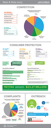
FTC Chairwoman Releases 2013 Annual Highlights


Federal Trade Commission Chairwoman Edith Ramirez released the agency’s 2013 Annual Highlights today at the Spring Meeting of the American Bar Association’s Section of Antirust Law in Washington emphasizing the agency’s work to protect consumers and promote competition during the past calendar year.

“The hallmark of our work has been, and will continue to be, our ability to adapt established tools – law enforcement, policy initiatives and education – to address economic challenges and technological advances that Congress could never have imagined when it created the FTC,” said Ramirez in her Highlights message.

Statistics and data for the Federal Trade Commission’s activities in 2013
The agency’s Enforcement Highlights address a range of law enforcement actions in industries including health care, technology, and energy and the environment. Promoting competition in the health care and pharmaceutical industries that reduces costs to consumers remains a top priority for the Commission and among the most notable accomplishments last year in this area, the FTC obtained two Supreme Court victories (FTC v. Actavis Inc., and FTC v. Phoebe Putney).

Focusing on the technology sector, the agency took its first actions involving mobile cramming and the Internet of Things. Law enforcement to stop consumer fraud continued to be a high priority for the agency along with its complementary order enforcement program. The FTC’s actions resulted in redress orders of more than $297 million and civil penalty orders of $20 million.

Friday, March 28, 2014

When water doesn't boil

Water boils at 212° Fahrenheit (100° Celsius) at standard pressure. If you take a few drops of water and toss them into a frying pan at 212° Fahrenheit or above, therefore, the water will start to boil. The water makes a sizzling sound as it rapidly evaporates and steam shoots out of the pan.

But sometimes, that doesn't happen. Sometimes, water droplets form in the pan and remain there, not boiling off.

Now I Know asks Why is that?

Thursday, March 27, 2014

2013 County and Economic Development Regions Population Estimates

On March 27th, 2014 the U.S. Census Bureau released the County total population estimates for July 1, 2013. This document from the Program on Applied Demographics at Cornell University highlights some of these estimates and results when aggregating into the Economic Development Regions. The change in population is split in change due to natural increase and due to net-migration. Natural increase is the difference between the number of births and the number of deaths, net-migration the result of people moving in- and out of a region.

Wednesday, March 26, 2014

Mining, Quarrying, Oil and Gas Extraction Booming, per First Results from Census Bureau’s 2012 Economic Census


The mining, quarrying, and oil and gas extraction sector of the economy showed tremendous growth from 2007 to 2012 as the number of establishments rose by 26.4 percent, according to the 2012 Economic Census Advance Report released today by the U.S. Census Bureau.

These results provide the first comprehensive look at the U.S. economy since the 2007 recession. The economic census is the most authoritative and comprehensive source of information about U.S. businesses from the national to the local level. It provides the foundation and benchmark for gross domestic product, monthly retail sales, as well as other indicators of economic performance.

“The economic census is one of the Commerce Department’s most valuable data resources,” U.S. Secretary of Commerce Penny Pritzker said. “By providing a close-up look at millions of U.S. companies in thousands of industries, the economic census is an important tool that informs policy at the local, state and national level, and helps businesses make critical decisions that drive economic growth and job creation. At the Department of Commerce, one of the top priorities of our ‘Open for Business Agenda’ is to make our data easier to access and understand so that it can continue enabling startups, moving markets, protecting life and property, and powering both small and large businesses across the country.”

Revenue for mining, quarrying, and oil and gas extraction grew 34.2 percent to $555.2 billion from 2007 to 2012. It also was among the fastest growers in employment as the number of employees rose 23.3 percent to 903,641.

“The growth shown by the 2012 Economic Census in the mining, quarrying, and oil and gas extraction sector supports the population growth we see in parts of the Great Plains,” Census Bureau Director John H. Thompson said. “These data drive our understanding of the economy, and when considered in context of our demographic data provide insight into growth trends.”

The 2012 Economic Census Advance Report is the first in a series of industry and geographic area data products.

Tuesday, March 25, 2014

HRC Foundation Releases State-By-State Report Detailing LGBT-related Legislation

The Human Rights Campaign Foundation released a comprehensive state-by-state report detailing LGBT-related legislation in 2013, a year marked by huge victories for the LGBT community from statehouses across the nation to the United States Supreme Court. The report indicates that the majority of pro-LGBT legislation came in the form of marriage equality legislation. This is the tenth year HRC has published this comprehensive guide to state legislation affecting LGBT people.

Monday, March 24, 2014

Population Bracketology

Test your knowledge of the relative populations of different geographic areas by participating in the U.S. Census Bureau’s version of “March Madness.” The Census Bureau’s Population Bracketology is an interactive data visualization allowing you to fill out your own bracket based on comparisons of state and metro area population. The objective is to pick the larger population between two metro areas or states and see how close you can come to a perfect score of 63. At the end, visitors can mouse over the choices to see the actual population numbers or view the data table.

The population statistics used in the matchups come from the 2012 population estimates. Other data visualizations can be viewed in the Census Bureau’s online gallery.

Saturday, March 22, 2014

Teaching Kids About Taxes: What Are They and Why Do We Pay Them

It’s that time of year when adults are getting paperwork organized and talking about taxes. Kids may be wondering what all the fuss is about. Here is a lesson plan for grades 3 - 5 that can be used to explain what income, property, and sales taxes are and why we pay them.

The IRS has a comprehensive website for teachers and students from middle school through college.

Friday, March 21, 2014

Local government data in NYS

Find information on the fiscal health of your communities and schools, the property tax cap and state spending and payments from the Office of the State Comptroller.

Thursday, March 20, 2014

Alzheimer's Disease: 2014 Facts and Figures

The Alzheimer's Association 2014 Alzheimer's Disease Facts and Figures report released this week reveals startling statistics on the ever-growing impact of Alzheimer's disease on our nation, including new information on growing death rates, the cost of the disease and the disproportionate burden of Alzheimer's disease on women.

"Despite being the nation's biggest health threat, Alzheimer's disease is still largely misunderstood. Everyone with a brain – male or female, family history or not – is at risk for Alzheimer's."
– Angela Geiger, Alzheimer's Association chief strategy officer

Unless something is done to change the course of the disease, there could be as many as 16 million Americans living with Alzheimer's in 2050, at a cost of $1.2 trillion (in current dollars). This video reveals more staggering facts from this year's report.

Wednesday, March 19, 2014

U.S. Agricultural Trade Data

From USDA:

U.S. trade data are collected by U.S. Department of Homeland Security, U.S. Customs and Border Protection and compiled and distributed by the U.S. Department of Commerce, U.S. Census Bureau using the United States' Harmonized Tariff Schedule (HTS) of 10-digit codes. Updated trade data are released monthly by the Census Bureau.

Foreign Agricultural Trade of the United States (FATUS) is a standard USDA aggregation of several thousand HTS codes into 213 agricultural groups most used by the public. This data product presents summary tables of FATUS data for U.S. merchandise trade, U.S. agricultural trade, value of high-value and bulk commodities, and top country export destinations and import sources for total U.S. agricultural trade.

Trade data are presented for three different time periods.

Monthly
Latest U.S. Agricultural Trade Data: Most current year-to-date, monthly data for total agricultural trade
U.S. Agricultural Trade Data Update: Most current year-todate, monthly data with commodity level detail
Fiscal Year: Annual (Oct.-Sept.) total trade and total agricultural trade
Calendar Year: Annual (Jan.-Dec.) total trade and total agricultural trade

Tuesday, March 18, 2014

Millennials in Adulthood: Detached from Institutions, Networked with Friends

The Millennial generation is forging a distinctive path into adulthood. Now ranging in age from 18 to 331, they are relatively unattached to organized politics and religion, linked by social media, burdened by debt, distrustful of people, in no rush to marry— and optimistic about the future.

They are also America’s most racially diverse generation. In all of these dimensions, they are different from today’s older generations. And in many, they are also different from older adults back when they were the age Millennials are now.

Read more from the Pew Research Center.

Monday, March 17, 2014

Women’s Lives and Challenges: Equality and Empowerment since 2000

From the Institute for Child, Youth, and Family Policy

Promoting gender equality and empowering women is one of the eight Millennium Development Goals (MDGs). The MDGs explicitly recognize that gender equality and women’s empowerment are not only human rights, but also play a powerful role in promoting development and reducing poverty. When women have the same opportunities, access to resources, and life choices as men, the benefits extend far beyond women themselves. As women work to strengthen their families and communities, they foster the education and health of the next generation, hasten economic growth, and strengthen public and private institutions.

A wealth of research has documented the inequities that women face from their earliest years and in every facet of
their lives, including in education, employment, marriage, parenthood, and political participation. Women also face
unique challenges, including meeting their reproductive health needs and the threat of gender-based violence.
Overcoming these challenges and empowering women to fulfill their potential as equal members of society requires
profound changes in attitudes, roles, and behaviors inside the home, at the workplace, and in the community. This report assesses the progress made toward gender equality and women’s empowerment since the MDGs were adopted in 2000. It summarizes findings from 95 surveys conducted by MEASURE DHS in 47 countries from 2000 to 2011. While the largest group of countries comes from sub-Saharan Africa, every region of the developing world is represented.

Friday, March 14, 2014

The placebo effect

The placebo effect is a real phenomenon, first identified in the 1950s and studied ever since, with sometimes surprising results. Take, for example, a 2008 study conducted by a team led by Dan Ariely, a behavioral economist at Duke University. Ariely and company gathered 82 people and gave them electric shocks in their wrists. Then, each of the test subjects were given one of two pills, shocked again, and asked to compare the pre-pill pain to the post-pill discomfort. Of the first group, 85% said the pill reduced the pain. On the other hand, only 61% of the second group said that the pill did its job. Whatever the researchers gave their "patients" worked -- but the first pill clearly worked better.

It shouldn't surprise you that some of these test subjects received placebos. That, however, is not the case. All of the test subjects received placebos, and on top of that, both groups received the exact thing -- sugar pills of identical size, shape, etc. So why did the first group feel less pain than the second?

SEE the answer at Now I Know.

Wednesday, March 12, 2014

Data brokers and what they know about you

Check out the 60 Minutes piece last week on data brokers? They have a LOT of info on you.

See also 60 Minutes Overtime; the first and third segments are about the topic.

Tuesday, March 11, 2014

Rising Costs Hitting Homeowners & Renters Across New York State

Housing costs in New York rose sharply relative to income from 2000 to 2012, with more than half of renters and more than a third of homeowners paying at least 30 percent of their 2012 income for a place to live, according to a report released by State Comptroller Thomas P. DiNapoli.


“Regardless of where they live, more New Yorkers are feeling pinched by rising housing costs,”DiNapoli said. “When half your income goes to pay for a place to live, you are going to be stretched thin on other every day purchases. This unfortunate trend has troubling implications for our economic growth and for New Yorkers’ quality of life.”

Monday, March 10, 2014

Earthquakes Today website

You may have heard about the magnitude 6.9 earthquake in the Pacific Ocean, off the coast of Eureka, CA. But did you know that, in the past 24 hours (as of this writing) there were 5.0+ magnitude quakes in Burma, Columbia, Indonesia, and Mexico?

Check out Earthquakes Today.

There are around 500,000 earthquakes each year. 100,000 of these can actually be felt. The largest earthquake ever recorded was a magnitude 9.5 (Mw) in Chile on May 22, 1960. The world's deadliest recorded earthquake occurred in 1556 in central China. It struck a region where most people lived in caves carved from soft rock. These dwellings collapsed during the earthquake, killing an estimated 830,000 people.

Friday, March 7, 2014

These 9 Maps Should Absolutely Outrage Southerners

Look, there are lots of things to love about the South. It's clean and quiet. There's delicious food, good people and often amazing weather. But that's exactly why it makes us so sad to think about all the ways in which the region is struggling today.

First off, poverty rates are a lot higher in the South.

More from HuffPo.

Thursday, March 6, 2014

Who Has Speedy Internet in the USA?

Internet speeds are so slow in the USA. But what about within the USA? Not surprisingly, they vary a great deal.

Not only do they vary but how they vary tells us some important things about factors that go beyond monopolies. One good source of information is this article from last year in Gizmodo which breaks the country down by congressional districts and then cross-references that data with income and population density.

One thing pretty clearly are the higher rates in areas of greatest population density. Montana seems to be in a particularly sad place.

More from Talking Points Memo.

Wednesday, March 5, 2014

What is Start-Up NY? Who is eligible? What are the benefits?

Ten months after Gov. Andrew M. Cuomo announced Start-Up NY, which offers 10 years of broad-based tax savings for companies that locate on or near college campuses, school and state officials say the program is generating considerable interest from the business community.

The governor touts Start-Up NY as an economic-development stimulus program that puts New York – upstate in particular – on an even footing with other states that have more business-friendly reputations.

Colleges here and across the state are awaiting formal approval of their tax-free zone boundaries, with an announcement from the state expected soon. But they’re already marketing Start-Up NY to potential partners...

Start-Up NY is meant to encourage start-up companies – or new divisions spun off from existing companies – to hire new employees and set up shop in a zone connected to a college.

The program’s rules ensure the jobs aren't shifted from somewhere else, the benefits go to new hires and the companies receiving the tax breaks have a connection to the schools.

But economic-development experts say it’s hard to say whether any of the tax-incentive programs introduced by the state have had a significant economic impact in New York, while critics say the program rewards new companies at the expense of existing companies.

More from the Buffalo News.

Tuesday, March 4, 2014

Security data analysis behind the times

From Search Security:

Security vendors often claim that attackers behave in unpredictable ways, but two of the researchers behind Verizon's annual Data Breach Investigations Report (DBIR) believe vendors can't spot emerging attack trends because they don't use modern data analysis techniques.

Damage caused by simple attacks, slow detection

For all the industry discussion about the evolution of so-called advanced cyberattacks, data ... indicates a select few attack types are responsible for the majority of last year's reported breaches. Despite that consistency, the majority of organizations fail to identify breaches until months after the initial compromise.

Monday, March 3, 2014

IMF study finds inequality is damaging to economic growth

From The Guardian:

The International Monetary Fund has backed economists who argue that inequality is a drag on growth in a discussion paper [PDF] that has also dismissed rightwing theories that efforts to redistribute incomes are self-defeating.

The Washington-based organisation, which advises governments on sustainable growth, said countries with high levels of inequality suffered lower growth than nations that distributed incomes more evenly.

Backing analysis by the Keynesian economist and Nobel prizewinner Joseph Stiglitz, it warned that inequality can also make growth more volatile and create the unstable conditions for a sudden slowdown in GDP growth.

And in what is likely to be viewed as its most controversial conclusion, the IMF said analysis of various efforts to redistribute incomes showed they had a neutral effect on GDP growth.

Saturday, March 1, 2014

TOP-RANKED PUBLIC UNIVERSITIES WITH THE BEST ROI: NORTHEASTERN U.S. REGION

The northeastern region is home to many of the nation’s top public universities. This list ranks the top public universities in each state in the northeastern region by their 30 year net return on investment (ROI). The schools are listed in order of lowest to highest 30 yr net ROI for in-state students.
The criteria for inclusion in the list was that each school must be the top ranked school in its state according to U.S. News and World Report.
The purpose of this list is to allow students to compare and contrast the average 30 year net ROI of the top public university in each state for in-state and out-of-state students.

See the list, and the #1 from NYS, from BestValueSchools.

Friday, February 28, 2014

New Internet Domain Extensions: Don't Get Blinded by the Sunrise or Run Over by the Landrush

2014 is going to be a landmark year for the Internet as the oldest and most basic form of user online navigation gets a major overhaul. The domain names that marketers and end users have relied on since the Internet's inception—extensions like .com, .net, and .org—will no longer be the only game in town. New generic top-level domains (gTLDs), including extensions such as .app, .sports, .club, .healthcare and many more, have already started to launch.

However, bringing those new extensions to market is more complicated than slapping on a price tag and hanging a for sale sign. It's been a multiyear process already; and, despite some hiccups, the organization that governs the Internet and is managing the rollout, http://newgtlds.icann.org/en ICANN, has tried to make it fair for everyone involved. Accordingly, introducing domains under a new extension is a multistep process that's designed to include protections for trademark holders and give average users a fair shake at getting the names they want.

Every marketer should understand the two important phases under this process: the Sunrise and the Landrush periods. ICANN mandates that a Sunrise period lasting at least 30 days must take place for every new domain extension that launches. During that timeframe, trademark holders are given an opportunity to claim domains that are associated with their marks before anyone else is able to register them. If multiple parties are seeking the same domain, disputes will be arbitrated or will go to auction at the end of the Sunrise period.

Read more from MarketingProfs.

Tuesday, February 25, 2014

Monday, February 24, 2014

This Is the Williamsburg of Your City: A Map of Hip America

What is your city's Williamsburg? What's its hippest—or formerly hippest—or sometimes just youngest—neighborhood, the one with the art galleries and the boutiques and the lines for brunch? (And what, for that matter, is its Bushwick, or "Next Williamsburg"?) If you don't know off the top of your head, don't worry. Today, we present to you the results—tabulated and mapped.

The Williamsburg of/is/(and its Bushwick is)
Albany, N.Y./Center Square/-
Buffalo, N.Y./Elmwood/Allentown
Hudson, N.Y./Warren St./-


More from Gawker.

Friday, February 21, 2014

How We Won—and Lost—the War on Poverty, in 6 Charts

President Lyndon B. Johnson announced a "war on poverty" in America in his State of the Union address on January 8, 1964. "This administration today, here and now, declares unconditional war on poverty in America," he said. "It will not be a short or easy struggle, no single weapon or strategy will suffice, but we shall not rest until that war is won. The richest nation on Earth can afford to win it. We cannot afford to lose it." The aim of the war, he said would be to "cure" and "prevent" poverty.

Johnson's administration went on to design "Great Society" initiatives, including a permanent food stamp program, Medicare and Medicaid, Head Start, which provides early education to low-income kids, and increased funding to public schools.

The war on poverty helped raise millions above the poverty line. During Johnson's years in office, the poverty rate dropped from 23 percent to 12 percent.

But where do we stand today? The government's official measure of poverty shows that poverty has actually increased slightly since the Johnson administration, rising from 14.2 percent in 1967 to 15 percent in 2012.

But those numbers aren't quite accurate...

More from Mother Jones.

Thursday, February 20, 2014

Magnets for Migrants: States with the Highest Domestic Migration Rates, 2012-13

The mobility rate of Americans has plunged over the past few decades, falling to historic lows in the aftermath of the Great Recession. Nevertheless, Americans are still moving and some states are attracting more movers than others, according to the most recent estimates from the Census Bureau. Here are the states, ranked from highest to lowest, with positive rates of net domestic migration (meaning more U.S. residents moved into the state than out of the state per 1,000 population) between July 1, 2012 and June 30, 2013...

1. North Dakota
2. District of Columbia
3. Colorado
4. South Carolina
5. South Dakota
6. Montana
7. Florida
8. Nevada
9. Wyoming
10. Texas
11. Arizona
12. North Carolina
13. Oklahoma
14. Delaware
15. Idaho
16. Oregon
17. Washington
18. Tennessee
19. Utah
20. Virginia
21. Iowa
22. Alabama

Among the 29 states with negative domestic migration rates (meaning more U.S. residents are moving out of the state than into the state per 1,000 population) Alaska had the fastest rate of outflow between 2012 and 2013, followed by New York, Illinois, New Jersey, and New Mexico.

Find great stats from the New Strategist.

Wednesday, February 19, 2014

New York county-to-county migration

Today the Census Bureau released County-to-County flow data based on the 2007-2011 ACS. This year the flows are cross-tabulated with education and income (individual and household). Last year they were cross-tabulated with sex, age, race and Hispanic origin.

More on that release HERE and HERE.

Data can be found through HERE and they have a mapping application where you can find out where people with certain characteristics come from and go to.

See also the data tabular format on a new web page. You can find estimates of the characteristics of people moving in and out of each County (“Overview”) or you can get estimates of the characteristics of people moving between two New York counties.

Tuesday, February 18, 2014

Looking for Number of Waterfront Homes in the US

From the BUSLIB listserv:

The American Housing Survey may be of use; latest is for 2011. There are links to AFF, but searching is cumbersome.

For 2009, though, the National Summary Report and Tables is in pdf - 175 pages. Much more direct.

Monday, February 17, 2014

Marrying Older, But Sooner?

The age when Americans marry for the first time has risen to its highest point since the 1950s. Although true, there is more to the story. With life expectancy increasing, Americans today are actually marrying sooner in their lifetime, despite marrying at older ages.

Although it is common to use the 1950s as a comparison period, doing so exaggerates how much the age at marriage has really risen . Looking at trends since 1890 reveals a U-shaped curve in which the 1950s and 1960s stand out as the exception for marriage, not the norm (estimates for these two decades are not significantly different from one another).

By the end of the 19th century, men married for the first time at 26 years old, three years later than they did in the decade following the Second World War. By 1900 their age at marriage began falling, and it took a full century before returning to its 1890 level. For women, it took 90 years. The idea then that our great-great-grandparents married when they were little older than teenagers is little more than myth.

More from the US Census.

Friday, February 14, 2014

The science behind a happy relationship

Regardless of how happy you are in a current relationship (and trust us, you'll find some fascinating facts on how marriage and kids can affect your happiness levels at different stages)--the main takeaway is that there are small changes you can make in your interactions that can boost your relationship satisfaction for the long run.

See the infographic from Happify.

Thursday, February 13, 2014

Where in the U.S. will you find the most “pleasant” days in a year?

“Pleasant” here means the mean temperature was between (55° F and 75° F), the minimum temperature was above 45° F, the maximum temperature was below 85° F and there was no significant precipitation or snow depth.

More from Kellegous.

Wednesday, February 12, 2014

New York State and energy

From HERE.

In 2010, New York was the eighth largest energy consumer in the United States, but, due in part to its widely used mass transportation systems, it had the second lowest energy consumption per capita after Rhode Island.

The Marcellus shale, which underlies southwestern New York, is estimated to hold at least 141 trillion cubic feet in technically recoverable natural gas.

The 2,353-megawatt Robert Moses Niagara hydroelectric power plant was the fourth largest hydroelectric power plant in the United States in 2010 and, in 2011, New York produced more hydroelectric power than any other State east of the Rocky Mountains.

New York's Renewable Portfolio Standard requires that 30 percent of electricity come from renewable energy resources by 2015; in 2011, 24 percent of electricity came from renewable energy resources.

In 2011, New York had the fourth highest average electricity prices in the United States.

More than half of New York households (53 percent) use individual window or wall air conditioning units, while only 20 percent have a central air conditioning system, according to EIA's Residential Energy Consumption Survey.


More Energy Information Agency data and maps.

Tuesday, February 11, 2014

Webinar Invitation - Economic Census - Industries Overview (Wed., 2 pm)

Tomorrow, Wednesday, Feb. 12, at 2 pm, the Census Bureau is hosting the second in a series of four webinars about the Economic Census. This 30-minute webinar will cover industry data from the Economic Census, primarily focusing on what is new for this 2012 data set.
Because you, our Census Bureau partners, serve as a direct link to local communities, you are in a position to help us disseminate information and data products from the Economic Census. This webinar series is meant to inform you about information from the Economic Census that is important to data users in your communities.
These webinars are recorded so that they can be used as a reference resource for data users, and will be housed on both the SDC and CIC websites.

Here is an overview of what will be covered in this week’s webinar.
What’s New for the 2012 Economic Census – Industries
a) New industries (solar, wind, geothermal, and biomass electric power generation)
b) Manufacturing industries consolidation
c) Other changes
d) Bridge and Comparative Statistics reports

Topic: Economic Census
Date: Wednesday, February 12, 2014
Time: 2:00 pm, EST
Meeting Number: 747 382 634
Meeting Password: 2012econ2

-------------------------------------------------------
To start or join the online meeting
-------------------------------------------------------
Go to https://census.webex.com/census/j.php?MTID=mc2cd54ef6cfb47b56c30478d75b93446

-------------------------------------------------------
Teleconference information
-------------------------------------------------------
Call-in toll-free number (Verizon): 1-877-950-4283 (US)
Attendee access code: 268 482 34

Democrats are from cities, Republicans are from exurbs

The first reaction many people may have when looking at a standard red/blue map of county-level election results is often "Holy crap, look at all that red!" While that huge red bulls-eye in the nation's middle is easily explained away—trees and tumbleweeds don't vote; only people do—when it's presented without disclaimers, it can help reinforce the perception that this is a "center-right nation." One of the best ways around that is with a cartogram (a map that distorts boundaries to account for another variable, like population) ... but how do we express that in a way that still looks like the United States, and not a piece of purple roadkill?

Princeton's Robert Vanderbei put together a fantastic 3-d map in 2012... that visualizes the country with blue skyscrapers towering over pink plains, reflecting the heavy concentration of votes in urban areas. However, I wanted to try going in a different direction, with a flat map, but one where the color varies by intensity according to the change in the number of votes over the years.

More from Daily Kos.

Friday, February 7, 2014

Identity Theft in 2012

Seventeen million Americans aged 16 or older were victims of identity theft in 2012, but only 14 percent of victims experienced out-of-pocket losses of $1 or more. Most were able to resolve the problem in a day or less, according to the Bureau of Justice Statistics' report Victims of Identity Theft, 2012. Despite the relatively minor inconvenience identity theft poses to most of its victims, a substantial 36 percent of identity theft victims reported moderate to severe emotional distress because of the incident.

Victims of identity theft are more likely than nonvictims to take measures to reduce the future risk of theft. Here is the percentage of identity theft victims (and the percentage of nonvictims) who took selected actions in the past 12 months...

Checked bank or credit statements: 92% (74%)
Shredded documents with personal information: 80% (67%)
Changed passwords on financial accounts: 56% (27%)
Checked credit report: 53% (37%)
Used identity theft security program on computer: 25% (16%)
Purchased credit monitoring service: 12% (5%)


Thanks to Demo Memo.

Thursday, February 6, 2014

Cities are growing

Between 2010 and 2012, the nation's largest cities (with populations of 50,000 or more) grew 2.1 percent. This was nearly double the 1.1 percent growth elsewhere. During the same time, the USDA reports population loss in nonmetropolitan areas--the first ever recorded. For more about this trend, see City Growth by Size, and Why Metros Are Growing, and Population Change along the Rural-Urban Continuum.

Wednesday, February 5, 2014

Surgeon General's Reports on Smoking and Tobacco Use

In honor of CVS banning the sale of tobacco products in its 7,600+ stores by October 1:
Surgeon General's Reports on Smoking and Tobacco Use. From the 2014 report:

In the last 50 years, 31 Surgeon General’s Reports have been released, increasing our understanding of the devastating health and financial burdens caused by tobacco use. We now know that smoking causes a host of cancers and other illnesses and is still the leading preventable cause of death in the United States, killing 443,000 people each year.

Tuesday, February 4, 2014

Computer and Internet Use in the United States: 2012

Based on Current Population Survey statistics from July 2012, the Computer and Internet Access in the United States infographic provides household and individual level analysis of computer use and Internet access, as well as a profile of individual smartphone usage.

Detailed Tables
Infographic PDF

2008-2012 American Community Survey Voting Age Population by Citizenship and Race

This tabulation from the 2008-2012 American Community Survey shows estimates of the citizen voting age population by race for small areas of geography.

The downloadable files show the population 18 and older by citizenship status and race for the nation, states, District of Columbia, Puerto Rico, counties, minor civil divisions, places, tracts and block groups. The files reflect both the population living in housing units and in group quarters, such as college dormitories. The new files and technical documentation along with previous versions of the files can be found on the Census Bureau’s Redistricting Data website.

This is the fourth year in a row that the American Community Survey has produced estimates of this population for even the smallest geographic areas. Prior to the American Community Survey, communities would have to wait 10 years for an update on the citizen voting-age population.

Monday, February 3, 2014

How much snow it takes to close schools (map)

A recent post on Reddit provided a map of the US, broken down by counties, which predicts the general amount of snow needed before your local school closes. It was created based on a combination of local news reports, a survey, and average snowfall levels from NOAA maps. It then makes an approximation of the differing levels of snow it takes to call off school.

From Herkimer and Oneida Counties Census Data Affiliate via HERE.